Tab navigation
Possibly the most common style of navigation in mobile apps is tab-based navigation. This can be tabs on the bottom of the screen or on the top below the header (or even instead of a header).
This guide covers createBottomTabNavigator. Before continuing, first install @react-navigation/bottom-tabs:
- npm
- Yarn
- pnpm
npm install @react-navigation/bottom-tabs@next
yarn add @react-navigation/bottom-tabs@next
pnpm add @react-navigation/bottom-tabs@next
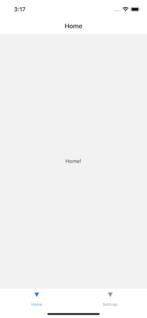
Minimal example of tab-based navigation
- Static
- Dynamic
import * as React from 'react';
import { View, Text } from 'react-native';
import { createStaticNavigation } from '@react-navigation/native';
import { createBottomTabNavigator } from '@react-navigation/bottom-tabs';

function HomeScreen() {
  return (
    <View style={{ flex: 1, justifyContent: 'center', alignItems: 'center' }}>
      <Text>Home!</Text>
    </View>
  );
}

function SettingsScreen() {
  return (
    <View style={{ flex: 1, justifyContent: 'center', alignItems: 'center' }}>
      <Text>Settings!</Text>
    </View>
  );
}

const RootTabs = createBottomTabNavigator({
  screens: {
    Home: HomeScreen,
    Settings: SettingsScreen,
  },
});

const Navigation = createStaticNavigation(RootTabs);

export default function App() {
  return <Navigation />;
}
import * as React from 'react';
import { Text, View } from 'react-native';
import { NavigationContainer } from '@react-navigation/native';
import { createBottomTabNavigator } from '@react-navigation/bottom-tabs';

function HomeScreen() {
  return (
    <View style={{ flex: 1, justifyContent: 'center', alignItems: 'center' }}>
      <Text>Home!</Text>
    </View>
  );
}

function SettingsScreen() {
  return (
    <View style={{ flex: 1, justifyContent: 'center', alignItems: 'center' }}>
      <Text>Settings!</Text>
    </View>
  );
}

const Tab = createBottomTabNavigator();

function RootTabs() {
  return (
    <Tab.Navigator>
      <Tab.Screen name="Home" component={HomeScreen} />
      <Tab.Screen name="Settings" component={SettingsScreen} />
    </Tab.Navigator>
  );
}

export default function App() {
  return (
    <NavigationContainer>
      <RootTabs />
    </NavigationContainer>
  );
}
Customizing the appearance
This is similar to how you would customize a stack navigator — there are some properties that are set when you initialize the tab navigator and others that can be customized per-screen in options.
- Static
- Dynamic
// You can import Ionicons from @expo/vector-icons/Ionicons if you use Expo or
// react-native-vector-icons/Ionicons otherwise.
import Ionicons from 'react-native-vector-icons/Ionicons';

const RootTabs = createBottomTabNavigator({
  screenOptions: ({ route }) => ({
    tabBarIcon: ({ focused, color, size }) => {
      let iconName;

      if (route.name === 'Home') {
        iconName = focused
          ? 'ios-information-circle'
          : 'ios-information-circle-outline';
      } else if (route.name === 'Settings') {
        iconName = focused ? 'ios-list' : 'ios-list-outline';
      }

      // You can return any component that you like here!
      return <Ionicons name={iconName} size={size} color={color} />;
    },
    tabBarActiveTintColor: 'tomato',
    tabBarInactiveTintColor: 'gray',
  }),
  screens: {
    Home: HomeScreen,
    Settings: SettingsScreen,
  },
});
// You can import Ionicons from @expo/vector-icons/Ionicons if you use Expo or
// react-native-vector-icons/Ionicons otherwise.
import Ionicons from 'react-native-vector-icons/Ionicons';

function RootTabs() {
  return (
    <Tab.Navigator
      screenOptions={({ route }) => ({
        tabBarIcon: ({ focused, color, size }) => {
          let iconName;

          if (route.name === 'Home') {
            iconName = focused
              ? 'ios-information-circle'
              : 'ios-information-circle-outline';
          } else if (route.name === 'Settings') {
            iconName = focused ? 'ios-list' : 'ios-list-outline';
          }

          // You can return any component that you like here!
          return <Ionicons name={iconName} size={size} color={color} />;
        },
        tabBarActiveTintColor: 'tomato',
        tabBarInactiveTintColor: 'gray',
      })}
    >
      <Tab.Screen name="Home" component={HomeScreen} />
      <Tab.Screen name="Settings" component={SettingsScreen} />
    </Tab.Navigator>
  );
}
Let's dissect this:
tabBarIconis a supported option in bottom tab navigator. So we know we can use it on our screen components in theoptionsprop, but in this case chose to put it in thescreenOptionsprop ofTab.Navigatorin order to centralize the icon configuration for convenience.tabBarIconis a function that is given thefocusedstate,color, andsizeparams. If you take a peek further down in the configuration you will seetabBarActiveTintColorandtabBarInactiveTintColor. These default to the iOS platform defaults, but you can change them here. Thecolorthat is passed through to thetabBarIconis either the active or inactive one, depending on thefocusedstate (focused is active). Thesizeis the size of the icon expected by the tab bar.- Read the full API reference for further information on
createBottomTabNavigatorconfiguration options.
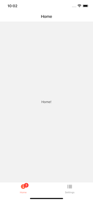
Add badges to icons
Sometimes we want to add badges to some icons. You can use the tabBarBadge option to do it:
- Static
- Dynamic
const RootTabs = createBottomTabNavigator({
  screens: {
    Home: {
      screen: HomeScreen,
      options: {
        tabBarBadge: 3,
      },
    },
    Settings: SettingsScreen,
  },
});
function RootTabs() {
  return (
    <Tab.Navigator>
      <Tab.Screen
        name="Home"
        component={HomeScreen}
        options={{
          tabBarBadge: 3,
        }}
      />
      <Tab.Screen name="Settings" component={SettingsScreen} />
    </Tab.Navigator>
  );
}
From UI perspective this component is ready to use, but you still need to find some way to pass down the badge count properly from somewhere else, like using React Context, Redux, MobX or event emitters.
Jumping between tabs
Switching from one tab to another has a familiar API — navigation.navigate.
function HomeScreen() {
  const navigation = useNavigation();

  return (
    <View style={{ flex: 1, justifyContent: 'center', alignItems: 'center' }}>
      <Text>Home!</Text>
      <Button
        title="Go to Settings"
        onPress={() => navigation.navigate('Settings')}
      />
    </View>
  );
}

function SettingsScreen() {
  const navigation = useNavigation();

  return (
    <View style={{ flex: 1, justifyContent: 'center', alignItems: 'center' }}>
      <Text>Settings!</Text>
      <Button title="Go to Home" onPress={() => navigation.navigate('Home')} />
    </View>
  );
}
A stack navigator for each tab
Often tabs don't just display one screen — for example, on your Twitter feed, you can tap on a tweet and it brings you to a new screen within that tab with all of the replies. You can think of this as there being separate navigation stacks within each tab, and that's exactly how we will model it in React Navigation.
import * as React from 'react';
import { Button, Text, View } from 'react-native';
import { NavigationContainer, useNavigation } from '@react-navigation/native';
import { createNativeStackNavigator } from '@react-navigation/native-stack';
import { createBottomTabNavigator } from '@react-navigation/bottom-tabs';

function DetailsScreen() {
  return (
    <View style={{ flex: 1, justifyContent: 'center', alignItems: 'center' }}>
      <Text>Details!</Text>
    </View>
  );
}

function HomeScreen() {
  const navigation = useNavigation();

  return (
    <View style={{ flex: 1, justifyContent: 'center', alignItems: 'center' }}>
      <Text>Home screen</Text>
      <Button
        title="Go to Details"
        onPress={() => navigation.navigate('Details')}
      />
    </View>
  );
}

function SettingsScreen() {
  const navigation = useNavigation();

  return (
    <View style={{ flex: 1, justifyContent: 'center', alignItems: 'center' }}>
      <Text>Settings screen</Text>
      <Button
        title="Go to Details"
        onPress={() => navigation.navigate('Details')}
      />
    </View>
  );
}

const HomeStack = createNativeStackNavigator();

function HomeStackScreen() {
  return (
    <HomeStack.Navigator>
      <HomeStack.Screen name="Home" component={HomeScreen} />
      <HomeStack.Screen name="Details" component={DetailsScreen} />
    </HomeStack.Navigator>
  );
}

const SettingsStack = createNativeStackNavigator();

function SettingsStackScreen() {
  return (
    <SettingsStack.Navigator>
      <SettingsStack.Screen name="Settings" component={SettingsScreen} />
      <SettingsStack.Screen name="Details" component={DetailsScreen} />
    </SettingsStack.Navigator>
  );
}

const Tab = createBottomTabNavigator();

export default function App() {
  return (
    <NavigationContainer>
      <Tab.Navigator screenOptions={{ headerShown: false }}>
        <Tab.Screen name="HomeStack" component={HomeStackScreen} />
        <Tab.Screen name="SettingsStack" component={SettingsStackScreen} />
      </Tab.Navigator>
    </NavigationContainer>
  );
}
Why do we need a TabNavigator instead of TabBarIOS or some other component?
It's common to attempt to use a standalone tab bar component without integrating it into the navigation library you use in your app. In some cases, this works fine! You should be warned, however, that you may run into some frustrating unanticipated issues when doing this.
For example, React Navigation's tab navigator takes care of handling the Android back button for you, while standalone components typically do not. Additionally, it is more difficult for you (as the developer) to perform actions such as "jump to this tab and then go to this screen" if you need to call into two distinct APIs for it. Lastly, mobile user interfaces have numerous small design details that require that certain components are aware of the layout or presence of other components — for example, if you have a translucent tab bar, content should scroll underneath it and the scroll view should have an inset on the bottom equal to the height of the tab bar so you can see all of the content. Double tapping the tab bar should make the active navigation stack pop to the top of the stack, and doing it again should scroll the active scroll view in that stack scroll to the top. While not all of these behaviors are implemented out of the box yet with React Navigation, they will be and you will not get any of this if you use a standalone tab view component.