底部选项卡导航器
屏幕底部有一个简单的选项卡栏,可让你在不同的路由之间切换。路由是延迟初始化的 - 它们的屏幕组件在第一次聚焦之前不会安装。
¥A simple tab bar on the bottom of the screen that lets you switch between different routes. Routes are lazily initialized -- their screen components are not mounted until they are first focused.
安装
¥Installation
要使用此导航器,请确保你有 @react-navigation/native 及其依赖(遵循本指南),然后安装 @react-navigation/bottom-tabs:
¥To use this navigator, ensure that you have @react-navigation/native and its dependencies (follow this guide), then install @react-navigation/bottom-tabs:
- npm
- Yarn
- pnpm
npm install @react-navigation/bottom-tabs
yarn add @react-navigation/bottom-tabs
pnpm add @react-navigation/bottom-tabs
用法
¥Usage
要使用此导航器,请从 @react-navigation/bottom-tabs 导入它:
¥To use this navigator, import it from @react-navigation/bottom-tabs:
- Static
- Dynamic
import { createBottomTabNavigator } from '@react-navigation/bottom-tabs';

const MyTabs = createBottomTabNavigator({
  screens: {
    Home: HomeScreen,
    Profile: ProfileScreen,
  },
});
import { createBottomTabNavigator } from '@react-navigation/bottom-tabs';

const Tab = createBottomTabNavigator();

function MyTabs() {
  return (
    <Tab.Navigator>
      <Tab.Screen name='Home' component={HomeScreen} />
      <Tab.Screen name='Profile' component={ProfileScreen} />
    </Tab.Navigator>
  );
}
API 定义
¥API Definition
属性
¥Props
除了所有导航器共享的 常用属性 之外,底部标签导航器还接受以下附加属性:
¥In addition to the common props shared by all navigators, the bottom tab navigator accepts the following additional props:
backBehavior
这控制在导航器中调用 goBack 时发生的情况。这包括在 Android 上按设备的后退按钮或后退手势。
¥This controls what happens when goBack is called in the navigator. This includes pressing the device's back button or back gesture on Android.
它支持以下值:
¥It supports the following values:
-
firstRoute- 返回导航器中定义的第一个屏幕(默认)¥
firstRoute- return to the first screen defined in the navigator (default) -
initialRoute- 返回initialRouteNameprop 中传入的初始屏幕,如果不传则默认到第一屏幕¥
initialRoute- return to initial screen passed ininitialRouteNameprop, if not passed, defaults to the first screen -
order- 返回到聚焦屏幕之前定义的屏幕¥
order- return to screen defined before the focused screen -
history- 返回导航器中上次访问的屏幕;如果多次访问同一屏幕,较旧的条目将从历史记录中删除¥
history- return to last visited screen in the navigator; if the same screen is visited multiple times, the older entries are dropped from the history -
fullHistory- 返回导航器中上次访问的屏幕;与history不同,不会删除重复条目 - 这种行为有助于模拟网页的工作方式¥
fullHistory- return to last visited screen in the navigator; doesn't drop duplicate entries unlikehistory- this behavior is useful to match how web pages work -
none- 不处理后退按钮¥
none- do not handle back button
detachInactiveScreens
布尔值用于指示是否应从视图层次结构中分离非活动屏幕以节省内存。这使得能够与 react-native-screens 集成。默认为 true。
¥Boolean used to indicate whether inactive screens should be detached from the view hierarchy to save memory. This enables integration with react-native-screens. Defaults to true.
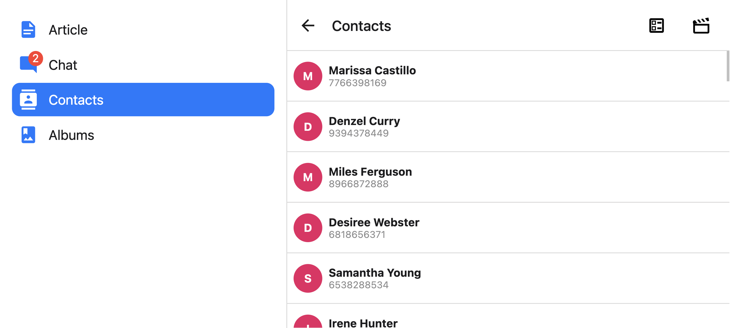
tabBar
返回一个 React 元素以显示为选项卡栏的函数。 =
¥Function that returns a React element to display as the tab bar.
该函数接收一个包含以下属性的对象作为参数:
¥The function receives an object containing the following properties as the argument:
-
state- 选项卡导航器的状态对象。¥
state- The state object for the tab navigator. -
descriptors- 包含选项卡导航器选项的描述符对象。¥
descriptors- The descriptors object containing options for the tab navigator. -
navigation- 标签导航器的导航对象。¥
navigation- The navigation object for the tab navigator.
state.routes 数组包含导航器中定义的所有路由。可以使用 descriptors[route.key].options 访问每个路由的选项。
¥The state.routes array contains all the routes defined in the navigator. Each route's options can be accessed using descriptors[route.key].options.
示例:
¥Example:
- Static
- Dynamic
import { View, Platform } from 'react-native';
import { useLinkBuilder, useTheme } from '@react-navigation/native';
import { Text, PlatformPressable } from '@react-navigation/elements';
import { createBottomTabNavigator } from '@react-navigation/bottom-tabs';

function MyTabBar({ state, descriptors, navigation }) {
  const { colors } = useTheme();
  const { buildHref } = useLinkBuilder();

  return (
    <View style={{ flexDirection: 'row' }}>
      {state.routes.map((route, index) => {
        const { options } = descriptors[route.key];
        const label =
          options.tabBarLabel !== undefined
            ? options.tabBarLabel
            : options.title !== undefined
              ? options.title
              : route.name;

        const isFocused = state.index === index;

        const onPress = () => {
          const event = navigation.emit({
            type: 'tabPress',
            target: route.key,
            canPreventDefault: true,
          });

          if (!isFocused && !event.defaultPrevented) {
            navigation.navigate(route.name, route.params);
          }
        };

        const onLongPress = () => {
          navigation.emit({
            type: 'tabLongPress',
            target: route.key,
          });
        };

        return (
          <PlatformPressable
            href={buildHref(route.name, route.params)}
            accessibilityState={isFocused ? { selected: true } : {}}
            accessibilityLabel={options.tabBarAccessibilityLabel}
            testID={options.tabBarButtonTestID}
            onPress={onPress}
            onLongPress={onLongPress}
            style={{ flex: 1 }}
          >
            <Text style={{ color: isFocused ? colors.primary : colors.text }}>
              {label}
            </Text>
          </PlatformPressable>
        );
      })}
    </View>
  );
}

const MyTabs = createBottomTabNavigator({
  tabBar: (props) => <MyTabBar {...props} />,
  screens: {
    Home: HomeScreen,
    Profile: ProfileScreen,
  },
});
import { View, Platform } from 'react-native';
import { useLinkBuilder, useTheme } from '@react-navigation/native';
import { Text, PlatformPressable } from '@react-navigation/elements';
import { createBottomTabNavigator } from '@react-navigation/bottom-tabs';

function MyTabBar({ state, descriptors, navigation }) {
  const { colors } = useTheme();
  const { buildHref } = useLinkBuilder();

  return (
    <View style={{ flexDirection: 'row' }}>
      {state.routes.map((route, index) => {
        const { options } = descriptors[route.key];
        const label =
          options.tabBarLabel !== undefined
            ? options.tabBarLabel
            : options.title !== undefined
              ? options.title
              : route.name;

        const isFocused = state.index === index;

        const onPress = () => {
          const event = navigation.emit({
            type: 'tabPress',
            target: route.key,
            canPreventDefault: true,
          });

          if (!isFocused && !event.defaultPrevented) {
            navigation.navigate(route.name, route.params);
          }
        };

        const onLongPress = () => {
          navigation.emit({
            type: 'tabLongPress',
            target: route.key,
          });
        };

        return (
          <PlatformPressable
            href={buildHref(route.name, route.params)}
            accessibilityState={isFocused ? { selected: true } : {}}
            accessibilityLabel={options.tabBarAccessibilityLabel}
            testID={options.tabBarButtonTestID}
            onPress={onPress}
            onLongPress={onLongPress}
            style={{ flex: 1 }}
          >
            <Text style={{ color: isFocused ? colors.primary : colors.text }}>
              {label}
            </Text>
          </PlatformPressable>
        );
      })}
    </View>
  );
}

function MyTabs() {
  return (
    <Tab.Navigator
      tabBar={(props) => <MyTabBar {...props} />}
    >
      <Tab.Screen name="Home" component={HomeScreen} />
      <Tab.Screen name="Profile" component={ProfileScreen} />
    </Tab.Navigator>
  );
}
此示例将渲染带有标签的基本选项卡栏。
¥This example will render a basic tab bar with labels.
请注意,你不能在 tabBar 内部使用 useNavigation 钩子,因为 useNavigation 只能在屏幕内部使用。你将获得 tabBar 的 navigation 属性,你可以使用它来代替:
¥Note that you cannot use the useNavigation hook inside the tabBar since useNavigation is only available inside screens. You get a navigation prop for your tabBar which you can use instead:
function MyTabBar({ navigation }) {
  return (
    <Button
      onPress={() => {
        // Navigate using the `navigation` prop that you received
        navigation.navigate('SomeScreen');
      }}
    >
      Go somewhere
    </Button>
  );
}
选项
¥Options
以下 options 可用于配置导航器中的屏幕。这些可以在 Tab.Navigator 的 screenOptions 属性或 Tab.Screen 的 options 属性下指定。
¥The following options can be used to configure the screens in the navigator. These can be specified under screenOptions prop of Tab.Navigator or options prop of Tab.Screen.
title
可用作 headerTitle 和 tabBarLabel 后备的通用标题。
¥Generic title that can be used as a fallback for headerTitle and tabBarLabel.
tabBarLabel
显示在选项卡栏中的选项卡的标题字符串或给定 { focused: boolean, color: string } 返回 React.Node 的函数,以显示在选项卡栏中。未定义时,使用场景 title。要隐藏,请参阅 tabBarShowLabel。
¥Title string of a tab displayed in the tab bar or a function that given { focused: boolean, color: string } returns a React.Node, to display in tab bar. When undefined, scene title is used. To hide, see tabBarShowLabel.
tabBarShowLabel
选项卡标签是否可见。默认为 true。
¥Whether the tab label should be visible. Defaults to true.
tabBarLabelPosition
标签是显示在图标下方还是图标旁边。
¥Whether the label is shown below the icon or beside the icon.
默认情况下,位置是根据设备宽度自动选择的。
¥By default, the position is chosen automatically based on device width.
-
below-icon:标签显示在图标下方(iPhone 的典型情况)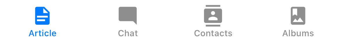
¥
below-icon: the label is shown below the icon (typical for iPhones) -
beside-icon标签显示在图标旁边(iPad 的典型情况)
¥
beside-iconthe label is shown next to the icon (typical for iPad)
tabBarLabelStyle
选项卡标签的样式对象。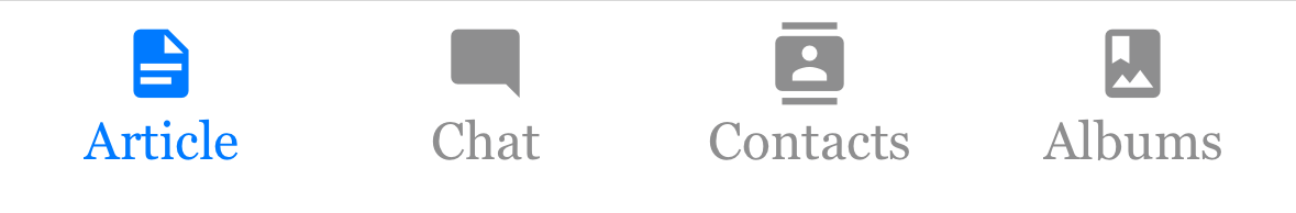
¥Style object for the tab label.
示例:
¥Example:
    tabBarLabelStyle: {
      fontSize: 16,
      fontFamily: 'Georgia',
      fontWeight: 300,
    },
tabBarIcon
给定 { focused: boolean, color: string, size: number } 的函数返回一个 React.Node,以显示在选项卡栏中。
¥Function that given { focused: boolean, color: string, size: number } returns a React.Node, to display in the tab bar.
tabBarIconStyle
选项卡图标的样式对象。
¥Style object for the tab icon.
tabBarBadge
要在选项卡图标上的徽章中显示的文本。接受 string 或 number。
¥Text to show in a badge on the tab icon. Accepts a string or a number.
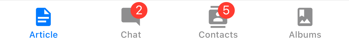
tabBarBadgeStyle
选项卡图标上的徽章样式。你可以在此处指定背景颜色或文本颜色。
¥Style for the badge on the tab icon. You can specify a background color or text color here.
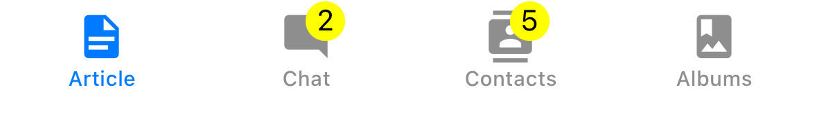
示例:
¥Example:
    tabBarBadgeStyle: {
      color: 'black',
      backgroundColor: 'yellow',
    },
tabBarAccessibilityLabel
选项卡按钮的辅助功能标签。当用户点击选项卡时,屏幕阅读器会读取此内容。如果你没有选项卡标签,建议设置此项。
¥Accessibility label for the tab button. This is read by the screen reader when the user taps the tab. It's recommended to set this if you don't have a label for the tab.
tabBarButton
返回一个 React 元素以渲染为选项卡栏按钮的函数。它封装着图标和标签。默认渲染 Pressable。
¥Function which returns a React element to render as the tab bar button. It wraps the icon and label. Renders Pressable by default.
你可以在此处指定自定义实现:
¥You can specify a custom implementation here:
tabBarButton: (props) => <TouchableOpacity {...props} />;
tabBarButtonTestID
在测试中找到此选项卡按钮的 ID。
¥ID to locate this tab button in tests.
tabBarActiveTintColor
活动选项卡中图标和标签的颜色。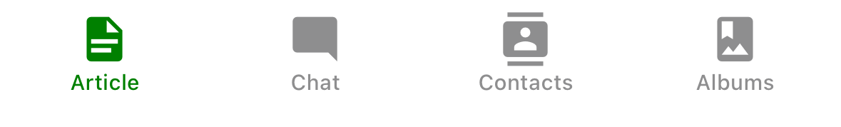
¥Color for the icon and label in the active tab.
tabBarInactiveTintColor
非活动选项卡中图标和标签的颜色。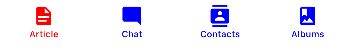
¥Color for the icon and label in the inactive tabs.
tabBarActiveBackgroundColor
活动选项卡的背景颜色。
¥Background color for the active tab.
tabBarInactiveBackgroundColor
非活动选项卡的背景颜色。
¥Background color for the inactive tabs.
tabBarHideOnKeyboard
键盘打开时标签栏是否隐藏。默认为 false。
¥Whether the tab bar is hidden when the keyboard opens. Defaults to false.
tabBarItemStyle
选项卡项容器的样式对象。
¥Style object for the tab item container.
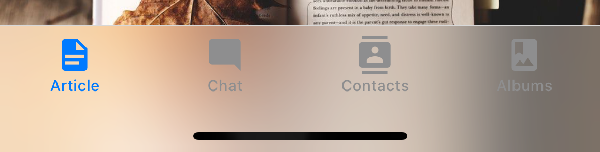
tabBarStyle
选项卡栏的样式对象。你可以在此处配置背景颜色等样式。
¥Style object for the tab bar. You can configure styles such as background color here.
要在选项卡栏下显示屏幕,可以将 position 样式设置为绝对:
¥To show your screen under the tab bar, you can set the position style to absolute:
<Tab.Navigator
  screenOptions={{
    tabBarStyle: { position: 'absolute' },
  }}
>
如果你有绝对定位的标签栏,你可能还需要为内容添加底部边距。React Navigation 不会自动执行此操作。详细信息请参见 useBottomTabBarHeight。
¥You also might need to add a bottom margin to your content if you have an absolutely positioned tab bar. React Navigation won't do it automatically. See useBottomTabBarHeight for more details.
tabBarBackground
返回一个 React 元素用作选项卡栏背景的函数。你可以渲染图片、渐变、模糊视图等:
¥Function which returns a React Element to use as background for the tab bar. You could render an image, a gradient, blur view etc.:
import { BlurView } from 'expo-blur';

// ...

<Tab.Navigator
  screenOptions={{
    tabBarStyle: { position: 'absolute' },
    tabBarBackground: () => (
      <BlurView tint="light" intensity={100} style={StyleSheet.absoluteFill} />
    ),
  }}
>
使用 BlurView 时,请确保在 tabBarStyle 中也设置 position: 'absolute'。你还需要使用 useBottomTabBarHeight 为你的内容添加底部填充。
¥When using BlurView, make sure to set position: 'absolute' in tabBarStyle as well. You'd also need to use useBottomTabBarHeight to add bottom padding to your content.
tabBarPosition
标签栏的位置。可用值为:
¥Position of the tab bar. Available values are:
-
bottom(默认)¥
bottom(Default) -
top -
left -
right
当标签栏位于 left 或 right 上时,它被设计为侧边栏。当你想在较大的屏幕上显示侧边栏并在较小的屏幕上显示底部标签栏时,这将很有用:
¥When the tab bar is positioned on the left or right, it is styled as a sidebar. This can be useful when you want to show a sidebar on larger screens and a bottom tab bar on smaller screens:
- Static
- Dynamic
const Tabs = createBottomTabNavigator({
  screenOptions: {
    tabBarPosition: isLargeScreen ? 'left' : 'bottom',
  },

  // ...
});
<Tab.Navigator
  screenOptions={{
    tabBarPosition: isLargeScreen ? 'left' ? 'bottom',
  }}
>
¥
你还可以通过将标签放在图标下方来渲染紧凑的侧边栏。这仅在 tabBarVariant 设置为 material 时才受支持:
¥You can also render a compact sidebar by placing the label below the icon. This is only supported when the tabBarVariant is set to material:
- Static
- Dynamic
const Tabs = createBottomTabNavigator({
  screenOptions: {
    tabBarPosition: isLargeScreen ? 'left' ? 'bottom',
    tabBarVariant: isLargeScreen ? 'material' : 'uikit',
    tabBarLabelPosition: 'below-icon',
  },

  // ...
});
<Tab.Navigator
  screenOptions={{
    tabBarPosition: dimensions.width < 600 ? 'bottom' : 'left',
    tabBarLabelPosition: 'below-icon',
  }}
>
tabBarVariant
标签栏的变体。可用值为:
¥Variant of the tab bar. Available values are:
-
uikit(默认) - 选项卡栏将根据 iOS UIKit 指南进行样式设置。¥
uikit(Default) - The tab bar will be styled according to the iOS UIKit guidelines. -
material- 选项卡栏将根据 Material Design 指南进行样式设置。¥
material- The tab bar will be styled according to the Material Design guidelines.
目前仅在 tabBarPosition 设置为 left 或 right 时才支持 material 变体。
¥The material variant is currently only supported when the tabBarPosition is set to left or right.
lazy
此屏幕是否应仅在首次访问后渲染。默认为 true。如果你想在导航器的初始渲染上渲染屏幕,请将其设置为 false。
¥Whether this screen should render only after the first time it's accessed. Defaults to true. Set it to false if you want to render the screen on the initial render of the navigator.
freezeOnBlur
布尔值,指示是否阻止非活动屏幕重新渲染。默认为 false。当 react-native-screens 包中的 enableFreeze() 在应用顶部运行时,默认为 true。
¥Boolean indicating whether to prevent inactive screens from re-rendering. Defaults to false.
Defaults to true when enableFreeze() from react-native-screens package is run at the top of the application.
仅支持 iOS 和 Android。
¥Only supported on iOS and Android.
popToTopOnBlur
布尔值,表示离开此选项卡时是否应将任何嵌套堆栈弹出到堆栈顶部。默认为 false。
¥Boolean indicating whether any nested stack should be popped to the top of the stack when navigating away from this tab. Defaults to false.
它仅在选项卡导航器下嵌套有堆栈导航器(例如 堆栈导航器 或 原生堆栈导航器)时才有效。
¥It only works when there is a stack navigator (e.g. stack navigator or native stack navigator) nested under the tab navigator.
sceneStyle
封装屏幕内容的组件的样式对象。
¥Style object for the component wrapping the screen content.
标题相关选项
¥Header related options
你可以找到标题相关选项 此处 的列表。这些 options 可以在 Tab.Navigator 的 screenOptions 属性或 Tab.Screen 的 options 属性下指定。你不必直接使用 @react-navigation/elements 来使用这些选项,它们只是记录在该页面中。
¥You can find the list of header related options here. These options can be specified under screenOptions prop of Tab.Navigator or options prop of Tab.Screen. You don't have to be using @react-navigation/elements directly to use these options, they are just documented in that page.
除此之外,底部选项卡还支持以下选项:
¥In addition to those, the following options are also supported in bottom tabs:
header
使用自定义标头代替默认标头。
¥Custom header to use instead of the default header.
它接受一个返回 React 元素以显示为标题的函数。该函数接收一个包含以下属性的对象作为参数:
¥This accepts a function that returns a React Element to display as a header. The function receives an object containing the following properties as the argument:
-
navigation- 当前屏幕的导航对象。¥
navigation- The navigation object for the current screen. -
route- 当前屏幕的路由对象。¥
route- The route object for the current screen. -
options- 当前屏幕的选项¥
options- The options for the current screen -
layout- 屏幕尺寸,包含height和width属性。¥
layout- Dimensions of the screen, containsheightandwidthproperties.
示例:
¥Example:
import { getHeaderTitle } from '@react-navigation/elements';

// ..

header: ({ navigation, route, options }) => {
  const title = getHeaderTitle(options, route.name);

  return <MyHeader title={title} style={options.headerStyle} />;
};
要为导航器中的所有屏幕设置自定义标题,你可以在导航器的 screenOptions 属性中指定此选项。
¥To set a custom header for all the screens in the navigator, you can specify this option in the screenOptions prop of the navigator.
在 headerStyle 中指定 height
¥Specify a height in headerStyle
如果你的自定义标题高度与默认标题高度不同,那么你可能会注意到由于测量异步而导致的故障。明确指定高度将避免此类故障。
¥If your custom header's height differs from the default header height, then you might notice glitches due to measurement being async. Explicitly specifying the height will avoid such glitches.
示例:
¥Example:
headerStyle: {
  height: 80, // Specify the height of your custom header
};
请注意,默认情况下,此样式不会应用于标头,因为你可以控制自定义标头的样式。如果你也想将此样式应用于标题,请使用 props 中的 options.headerStyle。
¥Note that this style is not applied to the header by default since you control the styling of your custom header. If you also want to apply this style to your header, use options.headerStyle from the props.
headerShown
是否显示或隐藏屏幕标题。默认情况下显示标题。将其设置为 false 会隐藏标题。
¥Whether to show or hide the header for the screen. The header is shown by default. Setting this to false hides the header.
活动
¥Events
导航器可以对某些操作进行 触发事件。支持的事件有:
¥The navigator can emit events on certain actions. Supported events are:
tabPress
当用户按下选项卡栏中当前屏幕的选项卡按钮时会触发此事件。默认情况下,按 Tab 键会执行以下几项操作:
¥This event is fired when the user presses the tab button for the current screen in the tab bar. By default a tab press does several things:
-
如果选项卡未获得焦点,按下选项卡将使该选项卡获得焦点
¥If the tab is not focused, tab press will focus that tab
-
如果该选项卡已获得焦点:
¥If the tab is already focused:
-
如果选项卡的屏幕渲染滚动视图,你可以使用
useScrollToTop将其滚动到顶部¥If the screen for the tab renders a scroll view, you can use
useScrollToTopto scroll it to top -
如果选项卡的屏幕渲染堆栈导航器,则会在堆栈上执行
popToTop操作¥If the screen for the tab renders a stack navigator, a
popToTopaction is performed on the stack
-
要防止默认行为,你可以调用 event.preventDefault:
¥To prevent the default behavior, you can call event.preventDefault:
- Static
- Dynamic
React.useEffect(() => {
  const unsubscribe = navigation.addListener('tabPress', (e) => {
    // Prevent default behavior
    e.preventDefault();

    // Do something manually
    // ...
  });

  return unsubscribe;
}, [navigation]);
React.useEffect(() => {
  const unsubscribe = navigation.addListener('tabPress', (e) => {
    // Prevent default behavior
    e.preventDefault();

    // Do something manually
    // ...
  });

  return unsubscribe;
}, [navigation]);
如果你有自定义选项卡栏,请确保发出此事件。
¥If you have a custom tab bar, make sure to emit this event.
默认情况下,标签页采用延迟渲染。因此,如果你在屏幕组件中添加监听器,则只有在屏幕首次获得焦点时才会接收到事件。如果你需要在屏幕获得焦点之前监听此事件,则可以指定 屏幕配置中的监听器。
¥By default, tabs are rendered lazily. So if you add a listener inside a screen component, it won't receive the event until the screen is focused for the first time. If you need to listen to this event before the screen is focused, you can specify the listener in the screen config instead.
tabLongPress
当用户长时间按下选项卡栏中当前屏幕的选项卡按钮时会触发此事件。如果你有自定义选项卡栏,请确保发出此事件。
¥This event is fired when the user presses the tab button for the current screen in the tab bar for an extended period. If you have a custom tab bar, make sure to emit this event.
示例:
¥Example:
React.useEffect(() => {
  const unsubscribe = navigation.addListener('tabLongPress', (e) => {
    // Do something
  });

  return unsubscribe;
}, [navigation]);
帮手
¥Helpers
选项卡导航器向导航对象添加以下方法:
¥The tab navigator adds the following methods to the navigation object:
jumpTo
导航到选项卡导航器中的现有屏幕。该方法接受以下参数:
¥Navigates to an existing screen in the tab navigator. The method accepts following arguments:
-
name- string - 要跳转到的路由名称。¥
name- string - Name of the route to jump to. -
params- object - 用于目标路由的屏幕参数。¥
params- object - Screen params to use for the destination route.
- Static
- Dynamic
navigation.jumpTo('Profile', { owner: 'Michaś' })
navigation.jumpTo('Profile', { owner: 'Michaś' })
钩子
¥Hooks
底部选项卡导航器导出以下钩子:
¥The bottom tab navigator exports the following hooks:
useBottomTabBarHeight
此钩子返回底部标签栏的高度。默认情况下,屏幕内容不会进入标签栏下方。但是,如果你想使标签栏绝对定位并让内容位于其下方(例如显示模糊效果),则需要调整内容以考虑标签栏高度。
¥This hook returns the height of the bottom tab bar. By default, the screen content doesn't go under the tab bar. However, if you want to make the tab bar absolutely positioned and have the content go under it (e.g. to show a blur effect), it's necessary to adjust the content to take the tab bar height into account.
示例:
¥Example:
import { useBottomTabBarHeight } from '@react-navigation/bottom-tabs';

function MyComponent() {
  const tabBarHeight = useBottomTabBarHeight();

  return (
    <ScrollView contentStyle={{ paddingBottom: tabBarHeight }}>
      {/* Content */}
    </ScrollView>
  );
}
或者,如果你正在使用类组件或在可在底部选项卡导航器之外使用的可重用组件中需要它,则可以直接使用 BottomTabBarHeightContext:
¥Alternatively, you can use the BottomTabBarHeightContext directly if you are using a class component or need it in a reusable component that can be used outside the bottom tab navigator:
import { BottomTabBarHeightContext } from '@react-navigation/bottom-tabs';

// ...

<BottomTabBarHeightContext.Consumer>
  {tabBarHeight => (
    /* render something */
  )}
</BottomTabBarHeightContext.Consumer>
动画
¥Animations
默认情况下,在选项卡之间切换没有任何动画。你可以指定 animation 选项来自定义过渡动画。
¥By default, switching between tabs doesn't have any animation. You can specify the animation option to customize the transition animation.
animation 支持的值包括:
¥Supported values for animation are:
-
fade- 用于屏幕转换的交叉淡入淡出动画,其中新屏幕淡入,旧屏幕淡出。¥
fade- Cross-fade animation for the screen transition where the new screen fades in and the old screen fades out. -
shift- 用于屏幕转换的移动动画,其中屏幕略微向左/向右移动。¥
shift- Shifting animation for the screen transition where the screens slightly shift to left/right. -
none- 屏幕转换没有任何动画。这是默认值。¥
none- The screen transition doesn't have any animation. This is the default value.
- Static
- Dynamic
const RootTabs = createBottomTabNavigator({
  screenOptions: {
    animation: 'fade',
  },
  screens: {
    Home: HomeScreen,
    Profile: ProfileScreen,
  },
});
const Tab = createBottomTabNavigator();

function RootTabs() {
  return (
    <Tab.Navigator
      screenOptions={{
        animation: 'fade',
      }}>
      <Tab.Screen name='Home' component={HomeScreen} />
      <Tab.Screen name='Profile' component={ProfileScreen} />
    </Tab.Navigator>
  );
}
如果你需要对动画进行更多控制,则可以使用各种与动画相关的选项自定义动画的各个部分:
¥If you need more control over the animation, you can customize individual parts of the animation using the various animation-related options:
动画相关选项
¥Animation related options
Bottom Tab Navigator 公开了切换选项卡时配置过渡动画的各种选项。这些过渡动画可以根据每个屏幕进行自定义,方法是在 options 中为每个屏幕指定选项,或者在 screenOptions 中为选项卡导航器中的所有屏幕指定选项。
¥Bottom Tab Navigator exposes various options to configure the transition animation when switching tabs. These transition animations can be customized on a per-screen basis by specifying the options in the options for each screen, or for all screens in the tab navigator by specifying them in the screenOptions.
-
transitionSpec- 指定动画类型(timing或spring)及其选项(例如timing的duration)的对象。它包含 2 个属性:¥
transitionSpec- An object that specifies the animation type (timingorspring) and its options (such asdurationfortiming). It contains 2 properties:-
animation- 用于动画的动画函数。支持的值为timing和spring。¥
animation- The animation function to use for the animation. Supported values aretimingandspring. -
config- 定时功能的配置对象。对于timing,可以是duration和easing。对于spring,可以是stiffness、damping、mass、overshootClamping、restDisplacementThreshold和restSpeedThreshold。¥
config- The configuration object for the timing function. Fortiming, it can bedurationandeasing. Forspring, it can bestiffness,damping,mass,overshootClamping,restDisplacementThresholdandrestSpeedThreshold.
一个使用定时动画的配置如下所示:
¥A config that uses a timing animation looks like this:
const config = {
  animation: 'timing',
  config: {
    duration: 150,
    easing: Easing.inOut(Easing.ease),
  },
};
我们可以在
transitionSpec选项中传递此配置:¥We can pass this config in the
transitionSpecoption: -
- Static
- Dynamic
{
  Profile: {
    screen: Profile,
    options: {
      transitionSpec: {
        animation: 'timing',
        config: {
          duration: 150,
          easing: Easing.inOut(Easing.ease),
        },
      },
    },
  },
}
<Tab.Screen
  name="Profile"
  component={Profile}
  options={{
    transitionSpec: {
      animation: 'timing',
      config: {
        duration: 150,
        easing: Easing.inOut(Easing.ease),
      },
    },
  }}
/>
-
sceneStyleInterpolator- 这是一个为场景的各个部分指定插值样式的函数。它目前支持包含屏幕的视图的样式:¥
sceneStyleInterpolator- This is a function that specifies interpolated styles for various parts of the scene. It currently supports style for the view containing the screen:-
sceneStyle- 封装屏幕内容的容器视图的样式。¥
sceneStyle- Style for the container view wrapping the screen content.
该函数在其参数中接收以下属性:
¥The function receives the following properties in its argument:
-
current- 当前屏幕的动画值:¥
current- Animation values for the current screen:-
progress- 代表当前屏幕进度值的动画节点。¥
progress- Animated node representing the progress value of the current screen.
-
一个淡出屏幕的配置如下所示:
¥A config that fades the screen looks like this:
const forFade = ({ current }) => ({
  sceneStyle: {
    opacity: current.progress.interpolate({
      inputRange: [-1, 0, 1],
      outputRange: [0, 1, 0],
    }),
  },
});current.progress的值如下:¥The value of
current.progressis as follows:-
如果索引低于活动选项卡,则为 -1,
¥-1 if the index is lower than the active tab,
-
0 如果它们处于活动状态,
¥0 if they're active,
-
如果索引高于活动选项卡,则为 1
¥1 if the index is higher than the active tab
我们可以在
sceneStyleInterpolator选项中传递这个函数:¥We can pass this function in
sceneStyleInterpolatoroption: -
- Static
- Dynamic
{
  Profile: {
    screen: Profile,
    options: {
      sceneStyleInterpolator: ({ current }) => ({
        sceneStyle: {
          opacity: current.progress.interpolate({
            inputRange: [-1, 0, 1],
            outputRange: [0, 1, 0],
          }),
        },
      }),
    },
  },
}
<Tab.Screen
  name="Profile"
  component={Profile}
  options={{
    sceneStyleInterpolator: ({ current }) => ({
      sceneStyle: {
        opacity: current.progress.interpolate({
          inputRange: [-1, 0, 1],
          outputRange: [0, 1, 0],
        }),
      },
    }),
  }}
/>
将这些放在一起,你可以自定义屏幕的过渡动画:
¥Putting these together, you can customize the transition animation for a screen:
将这些放在一起,你可以自定义屏幕的过渡动画:
¥Putting these together, you can customize the transition animation for a screen:
- Static
- Dynamic
const RootTabs = createBottomTabNavigator({
  screenOptions: {
    transitionSpec: {
      animation: 'timing',
      config: {
        duration: 150,
        easing: Easing.inOut(Easing.ease),
      },
    },
    sceneStyleInterpolator: ({ current }) => ({
      sceneStyle: {
        opacity: current.progress.interpolate({
          inputRange: [-1, 0, 1],
          outputRange: [0, 1, 0],
        }),
      },
    }),
  },
  screens: {
    Home: HomeScreen,
    Profile: ProfileScreen,
  },
});
const Tab = createBottomTabNavigator();

function RootTabs() {
  return (
    <Tab.Navigator
      screenOptions={{
        transitionSpec: {
          animation: 'timing',
          config: {
            duration: 150,
            easing: Easing.inOut(Easing.ease),
          },
        },
        sceneStyleInterpolator: ({ current }) => ({
          sceneStyle: {
            opacity: current.progress.interpolate({
              inputRange: [-1, 0, 1],
              outputRange: [0, 1, 0],
            }),
          },
        }),
      }}>
      <Tab.Screen name='Home' component={HomeScreen} />
      <Tab.Screen name='Profile' component={ProfileScreen} />
    </Tab.Navigator>
  );
}
预制配置
¥Pre-made configs
我们还从库中导出各种配置,其中包含可用于自定义动画的现成配置:
¥We also export various configs from the library with ready-made configs that you can use to customize the animations:
TransitionSpecs
-
FadeSpec- 屏幕之间淡入淡出动画的配置。¥
FadeSpec- Configuration for a cross-fade animation between screens. -
ShiftSpec- 屏幕之间移动动画的配置。¥
ShiftSpec- Configuration for a shifting animation between screens.
示例:
¥Example:
- Static
- Dynamic
import { TransitionSpecs } from '@react-navigation/bottom-tabs';

// ...

{
  Profile: {
    screen: Profile,
    options: {
      transitionSpec: TransitionSpecs.CrossFadeSpec,
    },
  },
}
import { TransitionSpecs } from '@react-navigation/bottom-tabs';

// ...

<Tab.Screen
  name="Profile"
  component={Profile}
  options={{
    transitionSpec: TransitionSpecs.FadeSpec,
  }}
/>;
SceneStyleInterpolators
-
forFade- 用于屏幕转换的交叉淡入淡出动画,其中新屏幕淡入,旧屏幕淡出。¥
forFade- Cross-fade animation for the screen transition where the new screen fades in and the old screen fades out. -
forShift- 用于屏幕转换的移动动画,其中屏幕略微向左/向右移动。¥
forShift- Shifting animation for the screen transition where the screens slightly shift to left/right.
示例:
¥Example:
- Static
- Dynamic
import { SceneStyleInterpolators } from '@react-navigation/bottom-tabs';

// ...

{
  Profile: {
    screen: Profile,
    options: {
      sceneStyleInterpolator: SceneStyleInterpolators.forFade,
    },
  },
}
import { SceneStyleInterpolators } from '@react-navigation/bottom-tabs';

// ...

<Tab.Screen
  name="Profile"
  component={Profile}
  options={{
    sceneStyleInterpolator: SceneStyleInterpolators.forFade,
  }}
/>;
TransitionPresets
我们导出将这些选项的各种集合打包在一起的过渡预设。过渡预设是一个对象,其中包含一些在 TransitionPresets 下导出的与动画相关的屏幕选项。目前可以使用以下预设:
¥We export transition presets that bundle various sets of these options together. A transition preset is an object containing a few animation-related screen options exported under TransitionPresets. Currently the following presets are available:
-
FadeTransition- 用于屏幕转换的交叉淡入淡出动画,其中新屏幕淡入,旧屏幕淡出。¥
FadeTransition- Cross-fade animation for the screen transition where the new screen fades in and the old screen fades out. -
ShiftTransition- 用于屏幕转换的移动动画,其中屏幕略微向左/向右移动。¥
ShiftTransition- Shifting animation for the screen transition where the screens slightly shift to left/right.
你可以在 options 中传播这些预设来自定义屏幕动画:
¥You can spread these presets in options to customize the animation for a screen:
示例:
¥Example:
- Static
- Dynamic
import { TransitionPresets } from '@react-navigation/bottom-tabs';

// ...

{
  Profile: {
    screen: Profile,
    options: {
      ...TransitionPresets.FadeTransition,
    },
  },
}
import { TransitionPresets } from '@react-navigation/bottom-tabs';

// ...

<Tab.Screen
  name="Profile"
  component={Profile}
  options={{
    ...TransitionPresets.FadeTransition,
  }}
/>;