标题按钮
现在我们知道如何自定义标题的外观,让我们让它们具有感知能力!实际上,这也许有点雄心勃勃,让我们让它们能够以非常明确的方式响应我们的触摸。
¥Now that we know how to customize the look of our headers, let's make them sentient! Actually perhaps that's ambitious, let's just make them able to respond to our touches in very well-defined ways.
在标题中添加按钮
¥Adding a button to the header
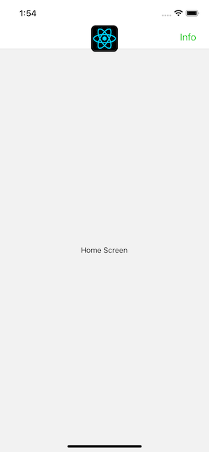
与标题交互的最常见方法是点击标题左侧或右侧的按钮。让我们在标题的右侧添加一个按钮(整个屏幕上最难触摸的地方之一,具体取决于手指和手机的大小,但也是放置按钮的正常位置)。
¥The most common way to interact with a header is by tapping on a button either to the left or the right of the title. Let's add a button to the right side of the header (one of the most difficult places to touch on your entire screen, depending on finger and phone size, but also a normal place to put buttons).
- Static
- Dynamic
const MyStack = createNativeStackNavigator({
  screens: {
    Home: {
      screen: HomeScreen,
      options: {
        headerRight: () => (
          <Button onPress={() => alert('This is a button!')}>Info</Button>
        ),
      },
    },
  },
});
function MyStack() {
  return (
    <Stack.Navigator>
      <Stack.Screen
        name="Home"
        component={HomeScreen}
        options={{
          headerRight: () => (
            <Button onPress={() => alert('This is a button!')}>Info</Button>
          ),
        }}
      />
    </Stack.Navigator>
  );
}
当我们以这种方式定义按钮时,options 中的 this 变量不是 HomeScreen 实例,因此你无法调用 setState 或其上的任何实例方法。这非常重要,因为通常希望标题中的按钮与标题所属的屏幕进行交互。因此,我们接下来将看看如何做到这一点。
¥When we define our button this way, the this variable in options is not the HomeScreen instance, so you can't call setState or any instance methods on it. This is pretty important because it's common to want the buttons in your header to interact with the screen that the header belongs to. So, we will look how to do this next.
请注意,社区开发的库可用于以正确的样式渲染标题中的按钮:react-navigation-header-buttons。
¥Note that a community-developed library for rendering buttons in the header with the correct styling is available: react-navigation-header-buttons.
标题与其屏幕组件交互
¥Header interaction with its screen component
在某些情况下,标题中的组件需要与屏幕组件进行交互。对于此用例,我们需要使用 navigation.setOptions 来更新我们的选项。通过在屏幕组件中使用 navigation.setOptions,我们可以访问屏幕的 props、状态、上下文等。
¥In some cases, components in the header need to interact with the screen component. For this use case, we need to use navigation.setOptions to update our options. By using navigation.setOptions inside the screen component, we get access to screen's props, state, context etc.
- Static
- Dynamic
function HomeScreen() {
  const navigation = useNavigation();
  const [count, setCount] = React.useState(0);

  React.useEffect(() => {
    // Use `setOptions` to update the button that we previously specified
    // Now the button includes an `onPress` handler to update the count
    navigation.setOptions({
      headerRight: () => (
        <Button onPress={() => setCount((c) => c + 1)}>Update count</Button>
      ),
    });
  }, [navigation]);

  return <Text>Count: {count}</Text>;
}

const MyStack = createNativeStackNavigator({
  screens: {
    Home: {
      screen: HomeScreen,
      options: {
        // Add a placeholder button without the `onPress` to avoid flicker
        headerRight: () => <Button>Update count</Button>,
      },
    },
  },
});
function HomeScreen() {
  const navigation = useNavigation();
  const [count, setCount] = React.useState(0);

  React.useEffect(() => {
    // Use `setOptions` to update the button that we previously specified
    // Now the button includes an `onPress` handler to update the count
    navigation.setOptions({
      headerRight: () => (
        <Button onPress={() => setCount((c) => c + 1)}>Update count</Button>
      ),
    });
  }, [navigation]);

  return <Text>Count: {count}</Text>;
}

function MyStack() {
  return (
    <Stack.Navigator>
      <Stack.Screen
        name="Home"
        component={HomeScreen}
        options={{
          // Add a placeholder button without the `onPress` to avoid flicker
          headerRight: () => <Button>Update count</Button>,
        }}
      />
    </Stack.Navigator>
  );
}
在这里,我们使用带有 onPress 处理程序的按钮更新 headerRight,该处理程序可以访问组件的状态并可以更新它。
¥Here we update the headerRight with a button with onPress handler that has access to the component's state and can update it.
自定义后退按钮
¥Customizing the back button
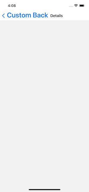
createNativeStackNavigator 为后退按钮提供特定于平台的默认值。在 iOS 上,这包括按钮旁边的一个标签,当标题适合可用空间时,该标签显示上一个屏幕的标题,否则显示 "后退"。
¥createNativeStackNavigator provides the platform-specific defaults for the back button. On iOS this includes a label next to the button, which shows the title of the previous screen when the title fits in the available space, otherwise it says "Back".
你可以使用 headerBackTitle 更改标签行为并使用 headerBackTitleStyle (阅读更多) 设置其样式。
¥You can change the label behavior with headerBackTitle and style it with headerBackTitleStyle (read more).
要自定义返回按钮图标,你可以使用 headerBackIcon。
¥To customize the back button icon, you can use headerBackIcon.
- Static
- Dynamic
const MyStack = createNativeStackNavigator({
  screens: {
    Home: {
      screen: HomeScreen,
      options: {
        headerBackTitle: 'Custom Back',
        headerBackTitleStyle: { fontSize: 30 },
      },
    },
  },
});
<Stack.Navigator>
  <Stack.Screen name="Home" component={HomeScreen} />
  <Stack.Screen
    name="Details"
    component={DetailsScreen}
    options={{
      headerBackTitle: 'Custom Back',
      headerBackTitleStyle: { fontSize: 30 },
    }}
  />
</Stack.Navigator>
覆盖后退按钮
¥Overriding the back button
只要用户可以从当前屏幕返回,后退按钮就会在堆栈导航器中自动渲染 - 换句话说,只要堆栈中存在多个屏幕,就会渲染后退按钮。
¥The back button will be rendered automatically in a stack navigator whenever it is possible for the user to go back from their current screen — in other words, the back button will be rendered whenever there is more than one screen in the stack.
一般来说,这就是你想要的。但在某些情况下,你可能比通过上述选项更想要自定义后退按钮,在这种情况下,你可以将 headerLeft 选项设置为将渲染的 React Element,就像我们对 headerRight 所做的那样。或者,headerLeft 选项还接受 React 组件,例如,该组件可用于覆盖后退按钮的 onPress 行为。在 API 参考 中了解更多相关信息。
¥Generally, this is what you want. But it's possible that in some circumstances that you want to customize the back button more than you can through the options mentioned above, in which case you can set the headerLeft option to a React Element that will be rendered, just as we did with headerRight. Alternatively, the headerLeft option also accepts a React Component, which can be used, for example, for overriding the onPress behavior of the back button. Read more about this in the api reference.
概括
¥Summary
-
可以通过
options中的headerLeft和headerRight属性设置页眉中的按钮。¥You can set buttons in the header through the
headerLeftandheaderRightproperties inoptions. -
返回按钮可通过
headerLeft完全自定义,但如果你只想更改标题或图片,则可以使用其他options组件 -headerBackTitle、headerBackTitleStyle和headerBackIcon。¥The back button is fully customizable with
headerLeft, but if you only want to change the title or image, there are otheroptionsfor that —headerBackTitle,headerBackTitleStyle, andheaderBackIcon. -
你可以使用 options 属性的回调来访问
navigation和route对象。¥You can use a callback for the options prop to access
navigationandrouteobjects.