原生堆栈导航器
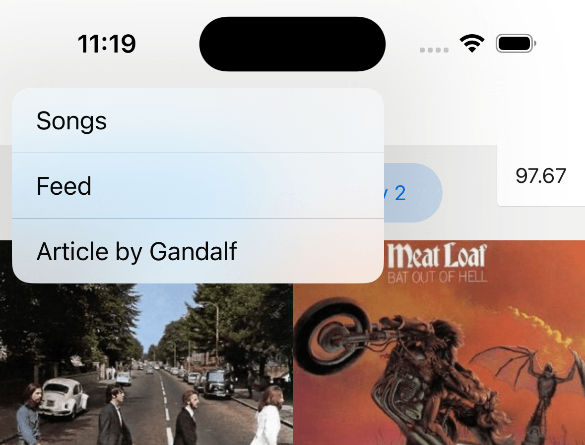
Native Stack Navigator 为你的应用提供了一种在屏幕之间进行转换的方法,其中每个新屏幕都放置在堆栈顶部。
¥Native Stack Navigator provides a way for your app to transition between screens where each new screen is placed on top of a stack.
该导航器在 iOS 上使用原生 API UINavigationController,在 Android 上使用 Fragment,因此使用 createNativeStackNavigator 构建的导航将与在这些 API 之上原生构建的应用的行为完全相同,并具有相同的性能特性。它还使用 react-native-web 提供基本的 Web 支持。
¥This navigator uses the native APIs UINavigationController on iOS and Fragment on Android so that navigation built with createNativeStackNavigator will behave exactly the same and have the same performance characteristics as apps built natively on top of those APIs. It also offers basic Web support using react-native-web.
需要记住的一件事是,虽然 @react-navigation/native-stack 提供原生性能并公开原生功能(例如 iOS 上的大标题等),但根据你的需求,它可能不像 @react-navigation/stack 那样可定制。因此,如果你需要比此导航器中更多的自定义功能,请考虑使用 @react-navigation/stack - 这是一个更加可定制的基于 JavaScript 的实现。
¥One thing to keep in mind is that while @react-navigation/native-stack offers native performance and exposes native features such as large title on iOS etc., it may not be as customizable as @react-navigation/stack depending on your needs. So if you need more customization than what's possible in this navigator, consider using @react-navigation/stack instead - which is a more customizable JavaScript based implementation.
安装
¥Installation
要使用此导航器,请确保你有 @react-navigation/native 及其依赖(遵循本指南),然后安装 @react-navigation/native-stack:
¥To use this navigator, ensure that you have @react-navigation/native and its dependencies (follow this guide), then install @react-navigation/native-stack:
- npm
- Yarn
- pnpm
npm install @react-navigation/native-stack
yarn add @react-navigation/native-stack
pnpm add @react-navigation/native-stack
用法
¥Usage
要使用此导航器,请从 @react-navigation/native-stack 导入它:
¥To use this navigator, import it from @react-navigation/native-stack:
- Static
- Dynamic
import { createNativeStackNavigator } from '@react-navigation/native-stack';

const MyStack = createNativeStackNavigator({
  screens: {
    Home: HomeScreen,
    Profile: ProfileScreen,
  },
});
import { createNativeStackNavigator } from '@react-navigation/native-stack';

const Stack = createNativeStackNavigator();

function MyStack() {
  return (
    <Stack.Navigator>
      <Stack.Screen name='Home' component={HomeScreen} />
      <Stack.Screen name='Profile' component={ProfileScreen} />
    </Stack.Navigator>
  );
}
如果你在使用 createNativeStackNavigator 时遇到任何错误,请在 react-native-screens 而不是 react-navigation 存储库上打开问题!
¥If you encounter any bugs while using createNativeStackNavigator, please open issues on react-native-screens rather than the react-navigation repository!
API 定义
¥API Definition
属性
¥Props
原生堆栈导航器接受所有导航器共享的 常用属性。
¥The native stack navigator accepts the common props shared by all navigators.
选项
¥Options
以下 options 可用于配置导航器中的屏幕:
¥The following options can be used to configure the screens in the navigator:
title
可用作 headerTitle 后备的字符串。
¥String that can be used as a fallback for headerTitle.
statusBarAnimation
设置状态栏动画(类似于 StatusBar 组件)。iOS 上默认为 fade,Android 上默认为 none。
¥Sets the status bar animation (similar to the StatusBar component). Defaults to fade on iOS and none on Android.
支持的值:
¥Supported values:
-
"fade" -
"none" -
"slide"
在 Android 上,设置 fade 或 slide 将设置状态栏颜色的过渡。在 iOS 上,此选项适用于状态栏的外观动画。
¥On Android, setting either fade or slide will set the transition of status bar color. On iOS, this option applies to appereance animation of the status bar.
需要在 Info.plist 文件中设置 View controller-based status bar appearance -> YES(或删除配置)。
¥Requires setting View controller-based status bar appearance -> YES (or removing the config) in your Info.plist file.
仅支持 Android 和 iOS。
¥Only supported on Android and iOS.
statusBarHidden
状态栏是否应在此屏幕上隐藏。
¥Whether the status bar should be hidden on this screen.
需要在 Info.plist 文件中设置 View controller-based status bar appearance -> YES(或删除配置)。
¥Requires setting View controller-based status bar appearance -> YES (or removing the config) in your Info.plist file.
仅支持 Android 和 iOS。
¥Only supported on Android and iOS.
statusBarStyle
设置状态栏颜色(类似于 StatusBar 组件)。
¥Sets the status bar color (similar to the StatusBar component).
支持的值:
¥Supported values:
-
"auto"(仅限 iOS)¥
"auto"(iOS only) -
"inverted"(仅限 iOS)¥
"inverted"(iOS only) -
"dark" -
"light"
iOS 上默认为 auto,Android 上默认为 light。
¥Defaults to auto on iOS and light on Android.
需要在 Info.plist 文件中设置 View controller-based status bar appearance -> YES(或删除配置)。
¥Requires setting View controller-based status bar appearance -> YES (or removing the config) in your Info.plist file.
仅支持 Android 和 iOS。
¥Only supported on Android and iOS.
statusBarBackgroundColor
此选项已弃用,将在未来的版本中移除(对于面向 Android SDK 35 或更高版本的应用,默认启用全屏显示模式,预计未来的 SDK 版本将强制执行全屏显示,更多信息请参阅 此处)。
¥This option is deprecated and will be removed in a future release (for apps targeting Android SDK 35 or above edge-to-edge mode is enabled by default and it is expected that the edge-to-edge will be enforced in future SDKs, see here for more information).
设置状态栏的背景颜色(类似于 StatusBar 组件)。
¥Sets the background color of the status bar (similar to the StatusBar component).
仅在 Android 上支持。
¥Only supported on Android.
statusBarTranslucent
此选项已弃用,将在未来的版本中移除(对于面向 Android SDK 35 或更高版本的应用,默认启用全屏显示模式,预计未来的 SDK 版本将强制执行全屏显示,更多信息请参阅 此处)。
¥This option is deprecated and will be removed in a future release (for apps targeting Android SDK 35 or above edge-to-edge mode is enabled by default and it is expected that the edge-to-edge will be enforced in future SDKs, see here for more information).
设置状态栏的半透明度(类似于 StatusBar 组件)。默认为 false。
¥Sets the translucency of the status bar (similar to the StatusBar component). Defaults to false.
仅在 Android 上支持。
¥Only supported on Android.
contentStyle
场景内容的样式对象。
¥Style object for the scene content.
animationMatchesGesture
关闭手势是否应使用提供给 animation 属性的动画。默认为 false。
¥Whether the gesture to dismiss should use animation provided to animation prop. Defaults to false.
不影响以模式渲染的屏幕的行为。
¥Doesn't affect the behavior of screens presented modally.
仅支持 iOS。
¥Only supported on iOS.
fullScreenGestureEnabled
关闭手势是否适用于整个屏幕。使用手势来关闭此选项会产生与 simple_push 相同的过渡动画。可以通过设置 customAnimationOnGesture 属性来更改此行为。由于平台限制,无法实现默认的 iOS 动画。默认为 false。
¥Whether the gesture to dismiss should work on the whole screen. Using gesture to dismiss with this option results in the same transition animation as simple_push. This behavior can be changed by setting customAnimationOnGesture prop. Achieving the default iOS animation isn't possible due to platform limitations. Defaults to false.
不影响以模式渲染的屏幕的行为。
¥Doesn't affect the behavior of screens presented modally.
仅支持 iOS。
¥Only supported on iOS.
fullScreenGestureShadowEnabled
全屏关闭手势在转换期间是否在视图下有阴影。默认为 true。
¥Whether the full screen dismiss gesture has shadow under view during transition. Defaults to true.
这不会影响不使用 fullScreenGestureEnabled prop 启用的手势的转换行为。
¥This does not affect the behavior of transitions that don't use gestures enabled by fullScreenGestureEnabled prop.
gestureEnabled
是否可以使用手势来关闭此屏幕。默认为 true。仅支持 iOS。
¥Whether you can use gestures to dismiss this screen. Defaults to true. Only supported on iOS.
animationTypeForReplace
当此屏幕替换另一个屏幕时要使用的动画类型。默认为 push。
¥The type of animation to use when this screen replaces another screen. Defaults to push.
支持的值:
¥Supported values:
-
push:新屏幕将执行推送动画。¥
push: the new screen will perform push animation. -
pop:新屏幕将播放流行动画。¥
pop: the new screen will perform pop animation.
animation
按下或弹出时屏幕应如何渲染动画。
¥How the screen should animate when pushed or popped.
仅支持 Android 和 iOS。
¥Only supported on Android and iOS.
支持的值:
¥Supported values:
-
default:使用平台默认动画¥
default: use the platform default animation -
fade:淡入或淡出屏幕¥
fade: fade screen in or out -
fade_from_bottom:从底部淡出新屏幕¥
fade_from_bottom: fade the new screen from bottom -
flip:翻转屏幕,需要presentation: "modal"(仅限 iOS)¥
flip: flip the screen, requirespresentation: "modal"(iOS only) -
simple_push:默认动画,但没有阴影和原生标题转换(仅限 iOS,在 Android 上使用默认动画)¥
simple_push: default animation, but without shadow and native header transition (iOS only, uses default animation on Android) -
slide_from_bottom:从底部滑入新屏幕¥
slide_from_bottom: slide in the new screen from bottom -
slide_from_right:从右侧滑入新屏幕(仅限 Android,在 iOS 上使用默认动画)¥
slide_from_right: slide in the new screen from right (Android only, uses default animation on iOS) -
slide_from_left:从左侧滑入新屏幕(仅限 Android,在 iOS 上使用默认动画)¥
slide_from_left: slide in the new screen from left (Android only, uses default animation on iOS) -
none:不要为屏幕设置动画¥
none: don't animate the screen
presentation
画面应该如何渲染。
¥How should the screen be presented.
仅支持 Android 和 iOS。
¥Only supported on Android and iOS.
支持的值:
¥Supported values:
-
card:新屏幕将被推送到堆栈上,这意味着 iOS 上的默认动画将从侧面滑动,Android 上的动画将根据操作系统版本和主题而有所不同。¥
card: the new screen will be pushed onto a stack, which means the default animation will be slide from the side on iOS, the animation on Android will vary depending on the OS version and theme. -
modal:新屏幕将以模态方式渲染。这还允许在屏幕内渲染嵌套堆栈。¥
modal: the new screen will be presented modally. this also allows for a nested stack to be rendered inside the screen. -
transparentModal:新屏幕将以模态方式渲染,但除此之外,上一个屏幕将保留,以便在屏幕背景为半透明的情况下仍然可以看到下面的内容。¥
transparentModal: the new screen will be presented modally, but in addition, the previous screen will stay so that the content below can still be seen if the screen has translucent background. -
containedModal:将在 iOS 上使用 "UIModalPresentationCurrentContext" 模态样式,并在 Android 上回退到 "modal"。¥
containedModal: will use "UIModalPresentationCurrentContext" modal style on iOS and will fallback to "modal" on Android. -
containedTransparentModal:将在 iOS 上使用 "UIModalPresentationOverCurrentContext" 模态样式,并在 Android 上回退到 "transparentModal"。¥
containedTransparentModal: will use "UIModalPresentationOverCurrentContext" modal style on iOS and will fallback to "transparentModal" on Android. -
fullScreenModal:将在 iOS 上使用 "UIModalPresentationFullScreen" 模态样式,并在 Android 上回退到 "modal"。使用此渲染样式的屏幕无法通过手势关闭。¥
fullScreenModal: will use "UIModalPresentationFullScreen" modal style on iOS and will fallback to "modal" on Android. A screen using this presentation style can't be dismissed by gesture. -
formSheet:将在 Android 上使用 "BottomSheetBehavior",在 iOS 上使用 "UIModalPresentationFormSheet" 模式样式。¥
formSheet: will use "BottomSheetBehavior" on Android and "UIModalPresentationFormSheet" modal style on iOS.
使用表单
¥Using Form Sheet
要将表单表用于你的屏幕,请将 presentation: 'formSheet' 添加到 options。
¥To use Form Sheet for your screen, add presentation: 'formSheet' to the options.
- Static
- Dynamic
import { createNativeStackNavigator } from '@react-navigation/native-stack';

const MyStack = createNativeStackNavigator({
  screens: {
    Home: {
      screen: HomeScreen,
    },
    Profile: {
      screen: ProfileScreen,
      options: {
        presentation: 'formSheet',
        headerShown: false,
        sheetAllowedDetents: 'fitToContents',
      },
    },
  },
});
import { createNativeStackNavigator } from '@react-navigation/native-stack';

const Stack = createNativeStackNavigator();

function MyStack() {
  return (
    <Stack.Navigator>
      <Stack.Screen name='Home' component={HomeScreen} />
      <Stack.Screen
        name='Profile'
        component={ProfileScreen}
        options={{
          presentation: 'formSheet',
          headerShown: false,
          sheetAllowedDetents: 'fitToContents',
        }} />
    </Stack.Navigator>
  );
}
由于平台组件与 react-native 集成的技术问题,presentation: 'formSheet' 对 flex: 1 的支持有限。
¥Due to technical issues in platform component integration with react-native, presentation: 'formSheet' has limited support for flex: 1.
在 Android 上,在传递给带有 showAllowedDetents: 'fitToContents' 的 formSheet 的顶层内容容器上使用 flex: 1 会导致工作表根本不显示,只留下暗淡的背景可见。这是因为尺寸的来源是工作表,而不是父级。为 sheetAllowedDetents 设置固定值(例如 [0.4, 0.9])可以正常工作(内容与最高定位对齐)。
¥On Android, using flex: 1 on a top-level content container passed to a formSheet with showAllowedDetents: 'fitToContents' causes the sheet to not display at all, leaving only the dimmed background visible. This is because it is the sheet, not the parent who is source of the size. Setting fixed values for sheetAllowedDetents, e.g. [0.4, 0.9], works correctly (content is aligned for the highest detent).
在 iOS 上,flex: 1 与 showAllowedDetents: 'fitToContents' 配合使用可以正常工作,但为 showAllowedDetents 设置固定值会导致屏幕不遵循 flex: 1 样式 - 容器的高度不会完全填满 formSheet,而是继承其内容的固有大小。目前,这种权衡是防止 iOS 上的 "表单闪烁" 问题 所必需的。
¥On iOS, flex: 1 with showAllowedDetents: 'fitToContents' works properly but setting a fixed value for showAllowedDetents causes the screen to not respect the flex: 1 style - the height of the container does not fill the formSheet fully, but rather inherits intrinsic size of its contents. This tradeoff is currently necessary to prevent "sheet flickering" problem on iOS.
如果你不使用 flex: 1,但内容的高度小于最大屏幕高度,则其余的工作表可能会变得半透明或使用默认主题背景颜色(你可以在 此 PR 描述的屏幕截图中看到这种情况)。要将表单与内容的背景相匹配,请在给定屏幕的 contentStyle 属性中设置 backgroundColor。
¥If you don't use flex: 1 but the content's height is less than max screen height, the rest of the sheet might become translucent or use the default theme background color (you can see this happening on the screenshots in the descrption of this PR). To match the sheet to the background of your content, set backgroundColor in the contentStyle prop of the given screen.
在 Android 上,嵌套 ScrollView 正常工作也存在一些问题。解决方案是在 ScrollView 上设置 nestedScrollEnabled,但如果内容的高度小于 ScrollView 的高度,则此方法不起作用。有关详细信息和建议的 workaround,请参阅 此 PR。
¥On Android, there are also some problems with getting nested ScrollViews to work properly. The solution is to set nestedScrollEnabled on the ScrollView, but this does not work if the content's height is less than the ScrollView's height. Please see this PR for details and suggested workaround.
在 Android 上,目前不支持 presentation: 'formSheet' 屏幕的嵌套堆栈和 headerShown prop。
¥On Android, nested stack and headerShown prop are not currently supported for screens with presentation: 'formSheet'.
sheetAllowedDetents
仅在 presentation 设置为 formSheet 时有效。
¥Works only when presentation is set to formSheet.
描述工作表可以放置的高度。
¥Describes heights where a sheet can rest.
支持的值:
¥Supported values:
-
fitToContents- 意图将工作表高度设置为其内容的高度。¥
fitToContents- intents to set the sheet height to the height of its contents. -
分数数组,例如
[0.25, 0.5, 0.75]:¥Array of fractions, e.g.
[0.25, 0.5, 0.75]:-
高度应描述为屏幕高度/最大定位高度的分数(
[0, 1]间隔中的数字)。¥Heights should be described as fraction (a number from
[0, 1]interval) of screen height / maximum detent height. -
数组必须按升序排序。此不变量仅在开发模式下验证,违反会导致错误。
¥The array must be sorted in ascending order. This invariant is verified only in developement mode, where violation results in error.
-
iOS 接受任意数量的定位点,而 Android 仅限于三个 - 除了前三个值之外的任何剩余值都将被忽略。
¥iOS accepts any number of detents, while Android is limited to three - any surplus values, beside first three are ignored.
-
默认为 [1.0]。
¥Defaults to [1.0].
仅支持 Android 和 iOS。
¥Only supported on Android and iOS.
sheetElevation
仅在 presentation 设置为 formSheet 时有效。
¥Works only when presentation is set to formSheet.
描述工作表高度的整数值,影响工作表顶部边缘的阴影。
¥Integer value describing elevation of the sheet, impacting shadow on the top edge of the sheet.
非动态 - 在组件渲染后更改它不会产生任何效果。
¥Not dynamic - changing it after the component is rendered won't have an effect.
默认为 24。
¥Defaults to 24.
仅在 Android 上支持。
¥Only supported on Android.
sheetExpandsWhenScrolledToEdge
仅在 presentation 设置为 formSheet 时有效。
¥Works only when presentation is set to formSheet.
滚动时,工作表是否应扩展为更大的定位点。
¥Whether the sheet should expand to larger detent when scrolling.
默认为 true。
¥Defaults to true.
仅支持 iOS。
¥Only supported on iOS.
请注意,要使此交互正常工作,ScrollView 必须是 Screen 组件的 "first-subview-chain" 后代。此限制是由于平台要求。
¥Please note that for this interaction to work, the ScrollView must be "first-subview-chain" descendant of the Screen component. This restriction is due to platform requirements.
sheetCornerRadius
仅在 presentation 设置为 formSheet 时有效。
¥Works only when presentation is set to formSheet.
工作表将尝试渲染的角半径。
¥The corner radius that the sheet will try to render with.
如果设置为非负值,它将尝试使用提供的半径渲染工作表,否则它将应用系统默认值。
¥If set to non-negative value it will try to render sheet with provided radius, else it will apply system default.
如果未设置,则使用系统默认值。
¥If left unset, system default is used.
仅支持 Android 和 iOS。
¥Only supported on Android and iOS.
sheetInitialDetentIndex
仅在 presentation 设置为 formSheet 时有效。
¥Works only when presentation is set to formSheet.
打开后工作表应展开到的定位点的索引。
¥Index of the detent the sheet should expand to after being opened.
如果指定的索引超出了 sheetAllowedDetents 数组的范围,则在开发环境中将引发更多错误,在生产中该值将重置为默认值。
¥If the specified index is out of bounds of sheetAllowedDetents array, in dev environment more errors will be thrown, in production the value will be reset to default value.
此外,还有 last 值可用,设置后表单将首先扩展到最后一个(最大)定位点。
¥Additionaly there is last value available, when set the sheet will expand initially to last (largest) detent.
默认为 0 - 代表定位器数组中的第一个定位器。
¥Defaults to 0 - which represents first detent in the detents array.
仅支持 Android 和 iOS。
¥Only supported on Android and iOS.
sheetGrabberVisible
仅在 presentation 设置为 formSheet 时有效。
¥Works only when presentation is set to formSheet.
布尔值表示工作表是否在顶部显示抓取器。
¥Boolean indicating whether the sheet shows a grabber at the top.
默认为 false。
¥Defaults to false.
仅支持 iOS。
¥Only supported on iOS.
sheetLargestUndimmedDetentIndex
仅在 presentation 设置为 formSheet 时有效。
¥Works only when presentation is set to formSheet.
最大的工作表定位点,其下方的视图不会变暗。
¥The largest sheet detent for which a view underneath won't be dimmed.
此 prop 可以设置为一个数字,表示 sheetAllowedDetents 数组中制动器的索引,对于该制动器,工作表下方不会有变暗的视图。
¥This prop can be set to an number, which indicates index of detent in sheetAllowedDetents array for which there won't be a dimming view beneath the sheet.
此外,还有以下可用选项:
¥Additionaly there are following options available:
-
none- 所有定位器级别都会有调光视图,¥
none- there will be dimming view for all detents levels, -
last- 任何定位器级别都不会有调光视图。¥
last- there won't be a dimming view for any detent level.
默认为 none,表示暗化视图应始终存在。
¥Defaults to none, indicating that the dimming view should be always present.
仅支持 Android 和 iOS。
¥Only supported on Android and iOS.
orientation
屏幕使用的显示方向。
¥The display orientation to use for the screen.
支持的值:
¥Supported values:
-
default- 在 iOS 上解析为 "all" 而没有 "portrait_down"。在 Android 上,这让系统决定最佳方向。¥
default- resolves to "all" without "portrait_down" on iOS. On Android, this lets the system decide the best orientation. -
all:所有方向都是允许的。¥
all: all orientations are permitted. -
portrait:允许纵向。¥
portrait: portrait orientations are permitted. -
portrait_up:允许右侧纵向。¥
portrait_up: right-side portrait orientation is permitted. -
portrait_down:允许颠倒的纵向方向。¥
portrait_down: upside-down portrait orientation is permitted. -
landscape:允许横向方向。¥
landscape: landscape orientations are permitted. -
landscape_left:允许横向左方向。¥
landscape_left: landscape-left orientation is permitted. -
landscape_right:允许横向向右方向。¥
landscape_right: landscape-right orientation is permitted.
仅支持 Android 和 iOS。
¥Only supported on Android and iOS.
autoHideHomeIndicator
指示主页指示器是否应该保持隐藏的布尔值。默认为 false。
¥Boolean indicating whether the home indicator should prefer to stay hidden. Defaults to false.
仅支持 iOS。
¥Only supported on iOS.
gestureDirection
设置滑动以关闭屏幕的方向。
¥Sets the direction in which you should swipe to dismiss the screen.
支持的值:
¥Supported values:
-
vertical- 垂直关闭屏幕¥
vertical– dismiss screen vertically -
horizontal- 水平关闭屏幕(默认)¥
horizontal– dismiss screen horizontally (default)
使用 vertical 选项时,默认设置选项 fullScreenGestureEnabled: true、customAnimationOnGesture: true 和 animation: 'slide_from_bottom'。
¥When using vertical option, options fullScreenGestureEnabled: true, customAnimationOnGesture: true and animation: 'slide_from_bottom' are set by default.
仅支持 iOS。
¥Only supported on iOS.
animationDuration
更改 iOS 上 slide_from_bottom、fade_from_bottom、fade 和 simple_push 转换的持续时间(以毫秒为单位)。默认为 350。
¥Changes the duration (in milliseconds) of slide_from_bottom, fade_from_bottom, fade and simple_push transitions on iOS. Defaults to 350.
default 和 flip 转换的持续时间不可自定义。
¥The duration of default and flip transitions isn't customizable.
仅支持 iOS。
¥Only supported on iOS.
navigationBarColor
此选项已弃用,将在未来的版本中移除(对于面向 Android SDK 35 或更高版本的应用,默认启用全屏显示模式,预计未来的 SDK 版本将强制执行全屏显示,更多信息请参阅 此处)。
¥This option is deprecated and will be removed in a future release (for apps targeting Android SDK 35 or above edge-to-edge mode is enabled by default and it is expected that the edge-to-edge will be enforced in future SDKs, see here for more information).
设置导航栏颜色。默认为初始状态栏颜色。
¥Sets the navigation bar color. Defaults to initial status bar color.
仅在 Android 上支持。
¥Only supported on Android.
navigationBarHidden
指示是否应隐藏导航栏的布尔值。默认为 false。
¥Boolean indicating whether the navigation bar should be hidden. Defaults to false.
仅在 Android 上支持。
¥Only supported on Android.
freezeOnBlur
布尔值,指示是否阻止非活动屏幕重新渲染。默认为 false。当 react-native-screens 包中的 enableFreeze() 在应用顶部运行时,默认为 true。
¥Boolean indicating whether to prevent inactive screens from re-rendering. Defaults to false.
Defaults to true when enableFreeze() from react-native-screens package is run at the top of the application.
仅支持 iOS 和 Android。
¥Only supported on iOS and Android.
scrollEdgeEffects
配置内容 ScrollView(位于 Screen 的第一个子类链中的 ScrollView)的滚动边缘效果。根据设置的值,它会模糊 ScrollView 指定边缘上某些 UI 元素(例如标题项、搜索栏)下方的滚动内容。当在嵌套容器中设置时,例如 Native Stack 位于 Native Bottom Tabs 内,反之亦然,ScrollView 将仅使用最内层容器的配置。
¥Configures the scroll edge effect for the content ScrollView (the ScrollView that is present in first descendants chain of the Screen). Depending on values set, it will blur the scrolling content below certain UI elements (e.g. header items, search bar) for the specified edge of the ScrollView. When set in nested containers, i.e. Native Stack inside Native Bottom Tabs, or the other way around, the ScrollView will use only the innermost one's config.
每个边缘都可以单独配置边缘效果。目前支持以下值:
¥Edge effects can be configured for each edge separately. The following values are currently supported:
-
automatic- 自动滚动边缘效果样式¥
automatic- the automatic scroll edge effect style, -
hard- 带有硬切线和分割线的滚动边缘效果,¥
hard- a scroll edge effect with a hard cutoff and dividing line, -
soft- 带有柔和边缘的滚动边缘效果,¥
soft- a soft-edged scroll edge effect, -
hidden- 无滚动边缘效果。¥
hidden- no scroll edge effect.
每个边缘默认为 automatic。
¥Defaults to automatic for each edge.
同时使用 blurEffect 和 scrollEdgeEffects(>= iOS 26)可能会导致效果重叠。
¥Using both blurEffect and scrollEdgeEffects (>= iOS 26) simultaneously may cause overlapping effects.
仅支持 iOS 26 及更高版本。
¥Only supported on iOS, starting from iOS 26.
标题相关选项
¥Header related options
导航器支持以下选项来配置标题栏:
¥The navigator supports following options to configure the header:
headerBackButtonMenuEnabled
布尔值,指示是否在长按 iOS >= 14 后退按钮时显示菜单。默认为 true。
¥Boolean indicating whether to show the menu on longPress of iOS >= 14 back button. Defaults to true.
仅支持 iOS。
¥Only supported on iOS.
headerBackVisible
后退按钮在标题中是否可见。如果你已指定,你可以使用它在 headerLeft 旁边显示后退按钮。
¥Whether the back button is visible in the header. You can use it to show a back button alongside headerLeft if you have specified it.
这对堆栈中的第一个屏幕没有影响。
¥This will have no effect on the first screen in the stack.
headerBackTitle
iOS 上后退按钮使用的标题字符串。默认为上一场景的标题、"后退" 或箭头图标,具体取决于可用空间。有关限制和自定义行为,请参见 headerBackButtonDisplayMode。
¥Title string used by the back button on iOS. Defaults to the previous scene's title, "Back" or arrow icon depending on the available space. See headerBackButtonDisplayMode to read about limitations and customize the behavior.
使用 headerBackButtonDisplayMode: "minimal" 隐藏它。
¥Use headerBackButtonDisplayMode: "minimal" to hide it.
仅支持 iOS。
¥Only supported on iOS.
headerBackButtonDisplayMode
后退按钮如何显示图标和标题。
¥How the back button displays icon and title.
支持的值:
¥Supported values:
-
"default" - 根据可用空间显示以下之一:上一个屏幕的标题、通用标题(例如 '后退')或无标题(仅图标)。
¥"default" - Displays one of the following depending on the available space: previous screen's title, generic title (e.g. 'Back') or no title (only icon).
-
"generic" – 根据可用空间显示以下之一:通用标题(例如 '后退')或无标题(仅图标)。
¥"generic" – Displays one of the following depending on the available space: generic title (e.g. 'Back') or no title (only icon).
-
"minimal" – 始终只显示没有标题的图标。
¥"minimal" – Always displays only the icon without a title.
在以下情况下,空间感知行为被禁用:
¥The space-aware behavior is disabled when:
-
iOS 版本为 13 或更低版本
¥The iOS version is 13 or lower
-
设置自定义字体系列或大小(例如使用
headerBackTitleStyle)¥Custom font family or size is set (e.g. with
headerBackTitleStyle) -
禁用后退按钮菜单(例如使用
headerBackButtonMenuEnabled)¥Back button menu is disabled (e.g. with
headerBackButtonMenuEnabled)
在这种情况下,始终会显示静态标题和图标。
¥In such cases, a static title and icon are always displayed.
仅支持 iOS。
¥Only supported on iOS.
headerBackTitleStyle
标题后标题的样式对象。支持的属性:
¥Style object for header back title. Supported properties:
-
fontFamily -
fontSize
仅支持 iOS。
¥Only supported on iOS.
示例:
¥Example:
headerBackTitleStyle: {
  fontSize: 14,
  fontFamily: 'Georgia',
},
headerBackIcon
页眉中显示的图标,作为后退按钮的图标。默认为平台对应的返回图标。
¥Icon to display in the header as the icon in the back button. Defaults to back icon image for the platform:
-
iOS 上的 V 形符号
¥A chevron on iOS
-
Android 上的箭头
¥An arrow on Android
目前仅支持图片源。
¥Currently only supports image sources.
示例:
¥Example:
headerBackIcon: {
  type: 'image',
  source: require('./path/to/icon.png'),
}
headerLargeStyle
显示大标题时的标题样式。如果 headerLargeTitleEnabled 是 true 并且任何可滚动内容的边缘到达标题的匹配边缘,则会显示大标题。
¥Style of the header when a large title is shown. The large title is shown if headerLargeTitleEnabled is true and the edge of any scrollable content reaches the matching edge of the header.
支持的属性:
¥Supported properties:
- backgroundColor
仅支持 iOS。
¥Only supported on iOS.
headerLargeTitleEnabled
是否启用带有大标题的标题,该标题在滚动时会折叠为常规标题。默认为 false。
¥Whether to enable header with large title which collapses to regular header on scroll.
Defaults to false.
要使大标题在滚动时折叠,屏幕的内容应包含在可滚动视图中,例如 ScrollView 或 FlatList。如果可滚动区域没有填满屏幕,则大标题不会在滚动时折叠。你还需要在 ScrollView、FlatList 等中指定 contentInsetAdjustmentBehavior="automatic"。
¥For large title to collapse on scroll, the content of the screen should be wrapped in a scrollable view such as ScrollView or FlatList. If the scrollable area doesn't fill the screen, the large title won't collapse on scroll. You also need to specify contentInsetAdjustmentBehavior="automatic" in your ScrollView, FlatList etc.
仅支持 iOS。
¥Only supported on iOS.
headerLargeTitleShadowVisible
显示大标题时标题的阴影是否可见。
¥Whether drop shadow of header is visible when a large title is shown.
headerLargeTitleStyle
标题中大标题的样式对象。支持的属性:
¥Style object for large title in header. Supported properties:
-
fontFamily -
fontSize -
fontWeight -
color
仅支持 iOS。
¥Only supported on iOS.
示例:
¥Example:
    headerLargeTitleStyle: {
      fontFamily: 'Georgia',
      fontSize: 22,
      fontWeight: '500',
      color: 'blue',
    },
headerStyle
标题的样式对象。支持的属性:
¥Style object for header. Supported properties:
backgroundColor
headerShadowVisible
是否隐藏标题上的标高阴影 (Android) 或底部边框 (iOS)。
¥Whether to hide the elevation shadow (Android) or the bottom border (iOS) on the header.
Android:
¥Android:
iOS:
¥iOS: 
headerTransparent
指示导航栏是否半透明的布尔值。
¥Boolean indicating whether the navigation bar is translucent.
默认为 false。设置为 true 使标题绝对定位 - 使标题浮动在屏幕上,使其与下面的内容重叠,并将背景颜色更改为 transparent,除非在 headerStyle 中指定。
¥Defaults to false. Setting this to true makes the header absolutely positioned - so that the header floats over the screen so that it overlaps the content underneath, and changes the background color to transparent unless specified in headerStyle.
如果你想渲染半透明标题或模糊背景,这非常有用。
¥This is useful if you want to render a semi-transparent header or a blurred background.
请注意,如果你不希望内容显示在标题下方,则需要手动为内容添加上边距。React Navigation 不会自动执行此操作。
¥Note that if you don't want your content to appear under the header, you need to manually add a top margin to your content. React Navigation won't do it automatically.
要获取标题的高度,可以将 HeaderHeightContext 与 React 的上下文 API 或 useHeaderHeight 结合使用。
¥To get the height of the header, you can use HeaderHeightContext with React's Context API or useHeaderHeight.
headerBlurEffect
半透明标题的模糊效果。需要将 headerTransparent 选项设置为 true 才能正常工作。
¥Blur effect for the translucent header. The headerTransparent option needs to be set to true for this to work.
支持的值:
¥Supported values:
-
extraLight -
light
¥
light -
dark
¥
dark -
regular
¥
regular -
prominent
¥
prominent -
systemUltraThinMaterial¥
systemUltraThinMaterial -
systemThinMaterial
¥
systemThinMaterial -
systemMaterial
¥
systemMaterial -
systemThickMaterial
¥
systemThickMaterial -
systemChromeMaterial
¥
systemChromeMaterial
-
systemUltraThinMaterialLight
¥
systemUltraThinMaterialLight
-
systemThinMaterialLight
¥
systemThinMaterialLight -
systemMaterialLight
¥
systemMaterialLight
-
systemThickMaterialLight
¥
systemThickMaterialLight -
systemChromeMaterialLight
¥
systemChromeMaterialLight -
systemUltraThinMaterialDark
¥
systemUltraThinMaterialDark -
systemThinMaterialDark
¥
systemThinMaterialDark -
systemMaterialDark
¥
systemMaterialDark -
systemThickMaterialDark
¥
systemThickMaterialDark -
systemChromeMaterialDark
¥
systemChromeMaterialDark
同时使用 blurEffect 和 scrollEdgeEffects(>= iOS 26)可能会导致效果重叠。
¥Using both blurEffect and scrollEdgeEffects (>= iOS 26) simultaneously may cause overlapping effects.
仅支持 iOS。
¥Only supported on iOS.
headerBackground
返回一个 React 元素以渲染为标题背景的函数。这对于使用图片或渐变等背景非常有用。
¥Function which returns a React Element to render as the background of the header. This is useful for using backgrounds such as an image or a gradient.
示例:
¥Example:
     headerBackground: () => (
      <LinearGradient
        colors={['#c17388', '#90306f']}
        style={{ flex: 1 }}
        start={{ x: 0, y: 0 }}
        end={{ x: 1, y: 0 }}
      />
      ),
headerTintColor
标题的色调颜色。更改后退按钮和标题的颜色。
¥Tint color for the header. Changes the color of back button and title.
headerLeft
返回一个 React 元素以显示在标题左侧的函数。这取代了后退按钮。请参阅 headerBackVisible 以显示左侧元素上的后退按钮。它会接收以下参数属性:
¥Function which returns a React Element to display on the left side of the header. This replaces the back button. See headerBackVisible to show the back button along side left element. It receives the following properties in the arguments:
-
tintColor- 要应用的色调颜色。默认为 theme 的主颜色。¥
tintColor- The tint color to apply. Defaults to the theme's primary color. -
canGoBack- 布尔值,指示是否有可返回的屏幕。¥
canGoBack- Boolean indicating whether there is a screen to go back to. -
label- 按钮的标签文本。通常是上一屏幕的标题。¥
label- Label text for the button. Usually the title of the previous screen. -
href- 用于 Web 端锚点标签的href¥
href- Thehrefto use for the anchor tag on web
示例:
¥Example:
    headerLeft: () => (
      <MaterialCommunityIcons name="map" color="gray" size={36} />
    ),
    headerBackVisible: true,
    headerBackTitle: 'Back',
unstable_headerLeftItems
此选项处于实验阶段,可能会在次要版本中更改。
¥This option is experimental and may change in a minor release.
返回要在标题左侧显示的项数组的函数。如果同时指定了 headerLeft 和 headerLeft,则此选项将覆盖 headerLeft。它会接收以下参数属性:
¥Function which returns an array of items to display as on the left side of the header. This will override headerLeft if both are specified. It receives the following properties in the arguments:
-
tintColor- 要应用的色调颜色。默认为 theme 的主颜色。¥
tintColor- The tint color to apply. Defaults to the theme's primary color. -
canGoBack- 布尔值,指示是否有可返回的屏幕。¥
canGoBack- Boolean indicating whether there is a screen to go back to.
示例:
¥Example:
unstable_headerRightItems: () => [
  {
    type: 'button',
    title: 'Edit',
    onPress: () => {
      // Do something
    },
  },
],
更多信息请参见 头部项目。
¥See Header items for more information.
仅支持 iOS。
¥Only supported on iOS.
headerRight
返回一个 React 元素以显示在标题右侧的函数。它会接收以下参数属性:
¥Function which returns a React Element to display on the right side of the header. It receives the following properties in the arguments:
-
tintColor- 要应用的色调颜色。默认为 theme 的主颜色。¥
tintColor- The tint color to apply. Defaults to the theme's primary color. -
canGoBack- 布尔值,指示是否有可返回的屏幕。¥
canGoBack- Boolean indicating whether there is a screen to go back to.
示例:
¥Example:
headerRight: () => <MaterialCommunityIcons name="map" color="blue" size={36} />;
unstable_headerRightItems
此选项处于实验阶段,可能会在次要版本中更改。
¥This option is experimental and may change in a minor release.
返回要在标题右侧显示的项数组的函数。如果同时指定了 headerRight 和 headerRight,则此选项将覆盖 headerRight。它会接收以下参数属性:
¥Function which returns an array of items to display as on the right side of the header. This will override headerRight if both are specified. It receives the following properties in the arguments:
-
tintColor- 要应用的色调颜色。默认为 theme 的主颜色。¥
tintColor- The tint color to apply. Defaults to the theme's primary color. -
canGoBack- 布尔值,指示是否有可返回的屏幕。¥
canGoBack- Boolean indicating whether there is a screen to go back to.
示例:
¥Example:
unstable_headerRightItems: () => [
  {
    type: 'button',
    title: 'Edit',
    onPress: () => {
      // Do something
    },
  },
],
更多信息请参见 头部项目。
¥See Header items for more information.
仅支持 iOS。
¥Only supported on iOS.
headerTitle
字符串或返回要由标头使用的 React 元素的函数。默认为 title 或屏幕名称。
¥String or a function that returns a React Element to be used by the header. Defaults to title or name of the screen.
当传递函数时,它会接收选项对象中的 tintColor 和 children 作为参数。标题字符串在 children 中传递。
¥When a function is passed, it receives tintColor andchildren in the options object as an argument. The title string is passed in children.
请注意,如果你通过传递函数来渲染自定义元素,则标题动画将不起作用。
¥Note that if you render a custom element by passing a function, animations for the title won't work.
headerTitleAlign
如何对齐标题标题。可能的值:
¥How to align the header title. Possible values:
-
left
¥
left -
center
¥
center
在 iOS 以外的平台上默认为 left。
¥Defaults to left on platforms other than iOS.
iOS 上不支持。在 iOS 上它始终是 center 并且无法更改。
¥Not supported on iOS. It's always center on iOS and cannot be changed.
headerTitleStyle
标题标题的样式对象。支持的属性:
¥Style object for header title. Supported properties:
-
fontFamily -
fontSize -
fontWeight -
color
示例:
¥Example:
    headerTitleStyle: {
      color: 'blue',
      fontSize: 22,
      fontFamily: 'Georgia',
      fontWeight: 300,
    },
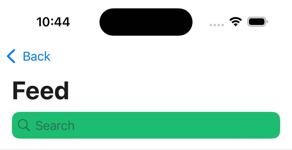
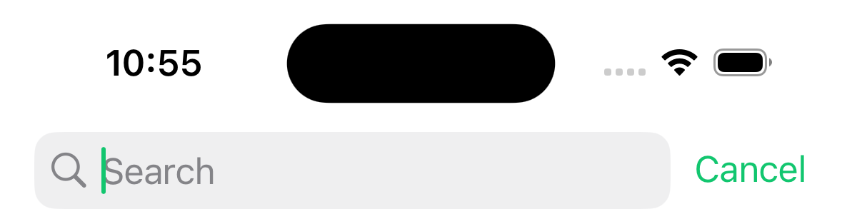
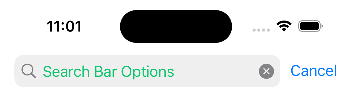
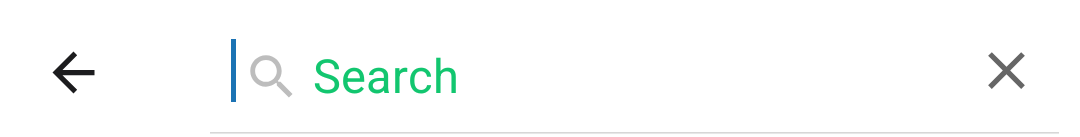
headerSearchBarOptions
是否渲染原生搜索栏的选项。搜索栏很少是静态的,因此通常通过将对象传递给组件主体中的 headerSearchBarOptions 导航选项来控制。
¥Options to render a native search bar. Search bars are rarely static so normally it is controlled by passing an object to headerSearchBarOptions navigation option in the component's body.
在 iOS 上,你还需要在 ScrollView、FlatList 等属性中指定 contentInsetAdjustmentBehavior="automatic"。如果没有 ScrollView,则指定 headerTransparent: false。
¥On iOS, you also need to specify contentInsetAdjustmentBehavior="automatic" in your ScrollView, FlatList etc. If you don't have a ScrollView, specify headerTransparent: false.
示例:
¥Example:
React.useLayoutEffect(() => {
  navigation.setOptions({
    headerSearchBarOptions: {
      // search bar options
    },
  });
}, [navigation]);
支持的属性有:
¥Supported properties are:
ref
Ref 用于命令式地操作搜索输入。它包含以下方法:
¥Ref to manipulate the search input imperatively. It contains the following methods:
-
focus- 聚焦搜索栏¥
focus- focuses the search bar -
blur- 从搜索栏中移除焦点¥
blur- removes focus from the search bar -
setText- 将搜索栏的内容设置为给定值¥
setText- sets the search bar's content to given value -
clearText- 删除搜索栏输入字段中存在的任何文本¥
clearText- removes any text present in the search bar input field -
cancelSearch- 取消搜索并关闭搜索栏¥
cancelSearch- cancel the search and close the search bar -
toggleCancelButton- 根据传递的布尔值,隐藏或显示取消按钮(仅 iOS 支持)¥
toggleCancelButton- depending on passed boolean value, hides or shows cancel button (only supported on iOS)
autoCapitalize
控制文本在用户输入时是否自动大写。可能的值:
¥Controls whether the text is automatically auto-capitalized as it is entered by the user. Possible values:
-
systemDefault -
none -
words -
sentences -
characters
默认为 systemDefault,在 iOS 上与 sentences 相同,在 Android 上与 none 相同。
¥Defaults to systemDefault which is the same as sentences on iOS and none on Android.
autoFocus
搜索栏显示时是否自动聚焦。默认为 false。
¥Whether to automatically focus search bar when it's shown. Defaults to false.
仅在 Android 上支持。
¥Only supported on Android.
barTintColor
搜索字段背景颜色。默认情况下,条形色调颜色是半透明的。
¥The search field background color. By default bar tint color is translucent.
仅支持 iOS。
¥Only supported on iOS.
tintColor
光标插入符号和取消按钮文本的颜色。
¥The color for the cursor caret and cancel button text.
仅支持 iOS。
¥Only supported on iOS.
cancelButtonText
用于代替默认 Cancel 按钮文本的文本。
¥The text to be used instead of default Cancel button text.
仅支持 iOS。从 iOS 26 开始已弃用。
¥Only supported on iOS. Deprecated starting from iOS 26.
disableBackButtonOverride
后退按钮是否应关闭搜索栏的文本输入。默认为 false。
¥Whether the back button should close search bar's text input or not. Defaults to false.
仅在 Android 上支持。
¥Only supported on Android.
hideNavigationBar
布尔值,表示搜索时是否隐藏导航栏。
¥Boolean indicating whether to hide the navigation bar during searching.
如果未设置,则使用系统默认值。
¥If left unset, system default is used.
仅支持 iOS。
¥Only supported on iOS.
hideWhenScrolling
布尔值,指示滚动时是否隐藏搜索栏。默认为 true。
¥Boolean indicating whether to hide the search bar when scrolling. Defaults to true.
仅支持 iOS。
¥Only supported on iOS.
inputType
输入的类型。默认为 "text"。
¥The type of the input. Defaults to "text".
支持的值:
¥Supported values:
-
"text" -
"phone" -
"number" -
"email"
仅在 Android 上支持。
¥Only supported on Android.
obscureBackground
布尔值,指示是否用半透明覆盖层遮盖底层内容。
¥Boolean indicating whether to obscure the underlying content with semi-transparent overlay.
如果未设置,则使用系统默认值。
¥If left unset, system default is used.
仅支持 iOS。
¥Only supported on iOS.
placement
控制搜索栏的首选位置。默认为 automatic。
¥Controls preferred placement of the search bar. Defaults to automatic.
支持的值:
¥Supported values:
-
automatic -
stacked -
inline(iOS 26 及更高版本已弃用,映射到integrated)¥
inline(deprecated starting from iOS 26, it is mapped tointegrated) -
integrated(iOS 26 及更高版本可用,在之前的版本中映射到inline)¥
integrated(available starting from iOS 26, on prior versions it is mapped toinline) -
integratedButton(iOS 26 及更高版本可用,在之前的版本中映射到inline)¥
integratedButton(available starting from iOS 26, on prior versions it is mapped toinline) -
integratedCentered(iOS 26 及更高版本可用,在之前的版本中映射到inline)¥
integratedCentered(available starting from iOS 26, on prior versions it is mapped toinline)
仅支持 iOS。
¥Only supported on iOS.
allowToolbarIntegration
布尔值,指示系统是否可以将搜索栏放置在 iPhone 的其他工具栏项目之间。
¥Boolean indicating whether the system can place the search bar among other toolbar items on iPhone.
将此属性设置为 false 可防止当 placement 为 automatic、integrated、integratedButton 或 integratedCentered 时,搜索栏出现在工具栏中。
¥Set this prop to false to prevent the search bar from appearing in the toolbar when placement is automatic, integrated, integratedButton or integratedCentered.
默认为 true。如果 placement 设置为 stacked,则此属性的值将被 false 覆盖。
¥Defaults to true. If placement is set to stacked, the value of this prop will be overridden with false.
仅支持 iOS 26 及更高版本。
¥Only supported on iOS, starting from iOS 26.
placeholder
搜索字段为空时显示的文本。
¥Text displayed when search field is empty.
textColor
搜索字段中文本的颜色。
¥The color of the text in the search field.
hintTextColor
搜索字段中提示文本的颜色。
¥The color of the hint text in the search field.
仅在 Android 上支持。
¥Only supported on Android.
headerIconColor
标题中显示的搜索和关闭图标的颜色
¥The color of the search and close icons shown in the header
仅在 Android 上支持。
¥Only supported on Android.
shouldShowHintSearchIcon
当搜索栏聚焦时是否显示搜索提示图标。默认为 true。
¥Whether to show the search hint icon when search bar is focused. Defaults to true.
仅在 Android 上支持。
¥Only supported on Android.
onBlur
当搜索栏失去焦点时调用的回调。
¥A callback that gets called when search bar has lost focus.
onCancelButtonPress
按下取消按钮时调用的回调。
¥A callback that gets called when the cancel button is pressed.
onChangeText
当文本更改时调用的回调。它接收搜索栏的当前文本值。
¥A callback that gets called when the text changes. It receives the current text value of the search bar.
示例:
¥Example:
const [search, setSearch] = React.useState('');

React.useLayoutEffect(() => {
  navigation.setOptions({
    headerSearchBarOptions: {
      onChangeText: (event) => setSearch(event.nativeEvent.text),
    },
  });
}, [navigation]);
headerShown
是否显示标题。默认情况下显示标题。将其设置为 false 会隐藏标题。
¥Whether to show the header. The header is shown by default. Setting this to false hides the header.
header
使用自定义标头代替默认标头。
¥Custom header to use instead of the default header.
它接受一个返回 React 元素以显示为标题的函数。该函数接收一个包含以下属性的对象作为参数:
¥This accepts a function that returns a React Element to display as a header. The function receives an object containing the following properties as the argument:
-
navigation- 当前屏幕的导航对象。¥
navigation- The navigation object for the current screen. -
route- 当前屏幕的路由对象。¥
route- The route object for the current screen. -
options- 当前屏幕的选项¥
options- The options for the current screen -
back- 后退按钮的选项,包含一个具有title属性的对象,用于后退按钮标签。¥
back- Options for the back button, contains an object with atitleproperty to use for back button label.
示例:
¥Example:
import { getHeaderTitle } from '@react-navigation/elements';

// ..

header: ({ navigation, route, options, back }) => {
  const title = getHeaderTitle(options, route.name);

  return (
    <MyHeader
      title={title}
      leftButton={
        back ? <MyBackButton onPress={navigation.goBack} /> : undefined
      }
      style={options.headerStyle}
    />
  );
};
要为导航器中的所有屏幕设置自定义标题,你可以在导航器的 screenOptions 属性中指定此选项。
¥To set a custom header for all the screens in the navigator, you can specify this option in the screenOptions prop of the navigator.
请注意,如果你指定自定义标题,则大标题、搜索栏等原生功能将无法工作。
¥Note that if you specify a custom header, the native functionality such as large title, search bar etc. won't work.
活动
¥Events
导航器可以对某些操作进行 触发事件。支持的事件有:
¥The navigator can emit events on certain actions. Supported events are:
transitionStart
当前屏幕的过渡动画开始时会触发此事件。
¥This event is fired when the transition animation starts for the current screen.
事件数据:
¥Event data:
-
e.data.closing- 布尔值,指示屏幕是否正在打开或关闭。¥
e.data.closing- Boolean indicating whether the screen is being opened or closed.
示例:
¥Example:
React.useEffect(() => {
  const unsubscribe = navigation.addListener('transitionStart', (e) => {
    // Do something
  });

  return unsubscribe;
}, [navigation]);
transitionEnd
当前屏幕的过渡动画结束时会触发此事件。
¥This event is fired when the transition animation ends for the current screen.
事件数据:
¥Event data:
-
e.data.closing- 指示屏幕是打开还是关闭的布尔值。¥
e.data.closing- Boolean indicating whether the screen was opened or closed.
示例:
¥Example:
React.useEffect(() => {
  const unsubscribe = navigation.addListener('transitionEnd', (e) => {
    // Do something
  });

  return unsubscribe;
}, [navigation]);
帮手
¥Helpers
原生堆栈导航器向导航对象添加以下方法:
¥The native stack navigator adds the following methods to the navigation object:
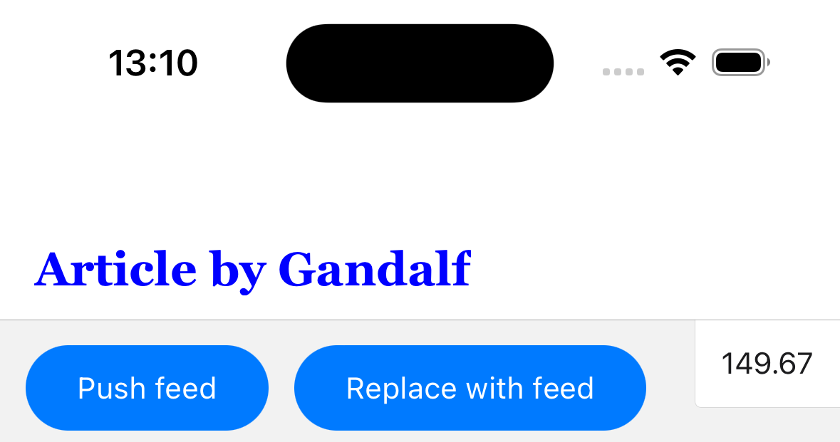
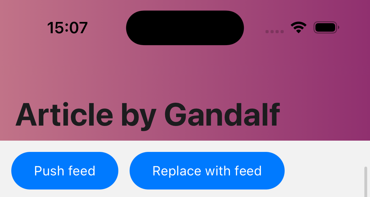
replace
将当前屏幕替换为堆栈中的新屏幕。该方法接受以下参数:
¥Replaces the current screen with a new screen in the stack. The method accepts the following arguments:
-
name- string - 要推入堆栈的路由名称。¥
name- string - Name of the route to push onto the stack. -
params- object - 屏幕参数传递到目标路由。¥
params- object - Screen params to pass to the destination route.
navigation.replace('Profile', { owner: 'Michaś' });
push
将新屏幕推送到堆栈顶部并导航到它。该方法接受以下参数:
¥Pushes a new screen to the top of the stack and navigate to it. The method accepts the following arguments:
-
name- string - 要推入堆栈的路由名称。¥
name- string - Name of the route to push onto the stack. -
params- object - 屏幕参数传递到目标路由。¥
params- object - Screen params to pass to the destination route.
navigation.push('Profile', { owner: 'Michaś' });
pop
从堆栈中弹出当前屏幕并导航回上一个屏幕。它需要一个可选参数 (count),它允许你指定要弹出的屏幕数。
¥Pops the current screen from the stack and navigates back to the previous screen. It takes one optional argument (count), which allows you to specify how many screens to pop back by.
navigation.pop();
popTo
通过弹出屏幕导航回堆栈中的上一个屏幕。该方法接受以下参数:
¥Navigates back to a previous screen in the stack by popping screens after it. The method accepts the following arguments:
-
name- string - 要导航到的路由的名称。¥
name- string - Name of the route to navigate to. -
params- object - 屏幕参数传递到目标路由。¥
params- object - Screen params to pass to the destination route. -
options- 包含以下属性的选项对象:¥
options- Options object containing the following properties:-
merge- boolean - 是否应将参数与现有路由参数合并,或替换它们(导航到现有屏幕时)。默认为false。¥
merge- boolean - Whether params should be merged with the existing route params, or replace them (when navigating to an existing screen). Defaults tofalse.
-
如果在堆栈中找不到匹配的屏幕,这将弹出当前屏幕并添加具有指定名称和参数的新屏幕。
¥If a matching screen is not found in the stack, this will pop the current screen and add a new screen with the specified name and params.
navigation.popTo('Profile', { owner: 'Michaś' });
popToTop
弹出堆栈中除第一个屏幕之外的所有屏幕并导航到它。
¥Pops all of the screens in the stack except the first one and navigates to it.
navigation.popToTop();
钩子
¥Hooks
原生堆栈导航器导出以下钩子:
¥The native stack navigator exports the following hooks:
useAnimatedHeaderHeight
钩子返回一个表示标题高度的动画值。这类似于 useHeaderHeight,但返回一个随着标题高度变化而变化的动画值,例如在 iOS 上展开或折叠大标题或搜索栏时。
¥The hook returns an animated value representing the height of the header. This is similar to useHeaderHeight but returns an animated value that changed as the header height changes, e.g. when expanding or collapsing large title or search bar on iOS.
它可用于随着标题高度变化为内容设置动画。
¥It can be used to animated content along with header height changes.
import { Animated } from 'react-native';
import { useAnimatedHeaderHeight } from '@react-navigation/native-stack';

const MyView = () => {
  const headerHeight = useAnimatedHeaderHeight();

  return (
    <Animated.View
      style={{
        height: 100,
        aspectRatio: 1,
        backgroundColor: 'tomato',
        transform: [{ translateY: headerHeight }],
      }}
    />
  );
};
头部项目
¥Header items
unstable_headerLeftItems 和 unstable_headerRightItems 选项分别允许你在标题栏的左侧和右侧添加标题项。这些项可以显示原生按钮、菜单或自定义 React 元素。
¥The unstable_headerLeftItems and unstable_headerRightItems options allow you to add header items to the left and right side of the header respectively. This items can show native buttons, menus or custom React elements.
在 iOS 26 及更高版本中,当空间不足以显示所有项目时,系统还可以将右侧标题栏项目折叠成溢出菜单。请注意,自定义元素(使用 type: 'custom')不会折叠到溢出菜单中。
¥On iOS 26+, the header right items can also be collapsed into an overflow menu by the system when there is not enough space to show all items. Note that custom elements (with type: 'custom') won't be collapsed into the overflow menu.
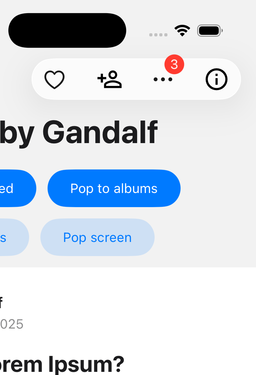
标题中可以显示 3 类项目:
¥There are 3 categories of items that can be displayed in the header:
操作
¥Action
按下时执行操作或显示菜单的普通按钮。
¥A regular button that performs an action when pressed, or shows a menu.
常用属性:
¥Common properties:
-
type:必须是button或menu。¥
type: Must bebuttonormenu. -
label:项目标签。如果指定了icon,则不显示标签。但是,屏幕阅读器会使用它,或者当标题项因空间不足而折叠时也会用到它。¥
label: Label of the item. The label is not shown ificonis specified. However, it is used by screen readers, or if the header items get collapsed due to lack of space. -
labelStyle:标签的样式对象。支持的属性:¥
labelStyle: Style object for the label. Supported properties:-
fontFamily -
fontSize -
fontWeight -
color
-
-
icon:可选图标,用于代替标签。¥
icon: Optional icon to show instead of the label.图标可以是图片:
¥The icon can be an image:
{
  type: 'image',
  source: require('./path/to/image.png'),
}
或者使用 SF Symbols 名称:
¥Or a SF Symbols name:
{
  type: 'sfSymbol',
  name: 'heart',
} -
variant:按钮的视觉变体。支持的值:¥
variant: Visual variant of the button. Supported values:-
plain(默认)¥
plain(default) -
done -
prominent
-
-
tintColor:应用于项目的色调颜色。¥
tintColor: Tint color to apply to the item. -
disabled:项目是否处于禁用状态。¥
disabled: Whether the item is disabled. -
width:项目宽度。¥
width: Width of the item. -
hidesSharedBackground(iOS 26+):是否应隐藏此项目可能与其他项目共享的背景。将其设置为true可隐藏液态玻璃背景。¥
hidesSharedBackground(iOS 26+): Whether the background this item may share with other items should be hidden. Setting this totruehides the liquid glass background. -
sharesBackground(iOS 26+):此菜单项是否可以与其他菜单项共享背景。¥
sharesBackground(iOS 26+): Whether this item can share a background with other items. -
identifier(iOS 26+) - 用于跨转换匹配项目的标识符。¥
identifier(iOS 26+) - An identifier used to match items across transitions. -
badge(iOS 26+):一个可选的徽章,用于显示在项目旁边。支持的属性:¥
badge(iOS 26+): An optional badge to display alongside the item. Supported properties:-
value:要在徽章中显示的值。它可以是字符串或数字。¥
value: The value to display in the badge. It can be a string or a number. -
style:徽章的样式对象。支持的属性:¥
style: Style object for the badge. Supported properties:-
fontFamily -
fontSize -
fontWeight -
color
-
-
-
accessibilityLabel:项目的辅助功能标签。¥
accessibilityLabel: Accessibility label for the item. -
accessibilityHint:项目的辅助功能提示。¥
accessibilityHint: Accessibility hint for the item.
当 type 为 button 时支持的属性:
¥Supported properties when type is button:
-
onPress:按钮按下时要调用的函数。¥
onPress: Function to call when the button is pressed. -
selected:按钮是否处于选中状态。¥
selected: Whether the button is in a selected state.
示例:
¥Example:
unstable_headerRightItems: () => [
  {
    type: 'button',
    label: 'Edit',
    icon: {
      type: 'sfSymbol',
      name: 'pencil',
    },
    onPress: () => {
      // Do something
    },
  },
],
当 type 为 menu 时支持的属性:
¥Supported properties when type is menu:
-
changesSelectionAsPrimaryAction:菜单是否为选择菜单。点击选择菜单中的项目将在所选项目上添加一个勾选标记。默认为false。¥
changesSelectionAsPrimaryAction: Whether the menu is a selection menu. Tapping an item in a selection menu will add a checkmark to the selected item. Defaults tofalse. -
menu:包含菜单项的对象。它包含以下属性:¥
menu: An object containing the menu items. It contains the following properties:-
title:可选标题,显示在菜单顶部。¥
title: Optional title to show on top of the menu. -
items:菜单项数组。菜单项可以是action或submenu。¥
items: An array of menu items. A menu item can be either anactionor asubmenu.-
action:一个包含以下属性的对象:¥
action: An object with the following properties:-
type:必须为action。¥
type: Must beaction. -
label:菜单项的标签。¥
label: Label of the menu item. -
icon:可选图标,显示在标签旁边。图标可以是 SF Symbols 的名称:¥
icon: Optional icon to show alongside the label. The icon can be a SF Symbols name:{
type: 'sfSymbol',
name: 'trash',
} -
onPress:菜单项按下时要调用的函数。¥
onPress: Function to call when the menu item is pressed. -
state:可选菜单项状态。支持的值:¥
state: Optional state of the menu item. Supported values:-
on -
off -
mixed
-
-
disabled:菜单项是否禁用。¥
disabled: Whether the menu item is disabled. -
destructive:菜单项是否设置为可破坏样式。¥
destructive: Whether the menu item is styled as destructive. -
hidden:菜单项是否隐藏。¥
hidden: Whether the menu item is hidden. -
keepsMenuPresented:选择此菜单项后是否保持菜单打开。默认为false。¥
keepsMenuPresented: Whether to keep the menu open after selecting this item. Defaults tofalse. -
discoverabilityLabel:解释操作目的的详细标题。¥
discoverabilityLabel: An elaborated title that explains the purpose of the action.
-
-
submenu:一个包含以下属性的对象:¥
submenu: An object with the following properties:-
type:必须为submenu。¥
type: Must besubmenu. -
label:子菜单项的标签。¥
label: Label of the submenu item. -
icon:可选图标,显示在标签旁边。图标可以是 SF Symbols 的名称:¥
icon: Optional icon to show alongside the label. The icon can be a SF Symbols name:{
type: 'sfSymbol',
name: 'pencil',
} -
items:菜单项数组(可以是action或submenu)。¥
items: An array of menu items (can be eitheractionorsubmenu).
-
-
-
示例:
¥Example:
unstable_headerRightItems: () => [
  {
    type: 'menu',
    label: 'Options',
    icon: {
      type: 'sfSymbol',
      name: 'ellipsis',
    },
    menu: {
      title: 'Options',
      items: [
        {
          type: 'action',
          label: 'Edit',
          icon: {
            type: 'sfSymbol',
            name: 'pencil',
          },
          onPress: () => {
            // Do something
          },
        },
        {
          type: 'submenu',
          label: 'More',
          items: [
            {
              type: 'action',
              label: 'Delete',
              destructive: true,
              onPress: () => {
                // Do something
              },
            },
          ],
        },
      ],
    },
  },
],
间距
¥Spacing
用于在标题中的其他项目之间添加间距的项目。
¥An item to add spacing between other items in the header.
支持的属性:
¥Supported properties:
-
type:必须为spacing。¥
type: Must bespacing. -
spacing:要添加的间距量。¥
spacing: Amount of spacing to add.
unstable_headerRightItems: () => [
  {
    type: 'button',
    label: 'Edit',
    onPress: () => {
      // Do something
    },
  },
  {
    type: 'spacing',
    spacing: 10,
  },
  {
    type: 'button',
    label: 'Delete',
    onPress: () => {
      // Do something
    },
  },
],
自定义
¥Custom
用于在标题中显示任何 React 元素的自定义菜单项。
¥A custom item to display any React Element in the header.
支持的属性:
¥Supported properties:
-
type:必须为custom。¥
type: Must becustom. -
element:用于显示为菜单项的 React 元素。¥
element: A React Element to display as the item. -
hidesSharedBackground:是否应隐藏此项目可能与其他项目共享的背景。在 iOS 26 及更高版本中,将其设置为true可隐藏液态玻璃背景。¥
hidesSharedBackground: Whether the background this item may share with other items in the bar should be hidden. Setting this totruehides the liquid glass background on iOS 26+.
示例:
¥Example:
unstable_headerRightItems: () => [
  {
    type: 'custom',
    element: <MaterialCommunityIcons name="map" color="gray" size={36} />,
  },
],
与 headerLeft 或 headerRight 选项相比,使用此选项的优势在于它支持 iOS 26 及更高版本中的共享背景等功能。
¥The advantage of using this over headerLeft or headerRight options is that it supports features like shared background on iOS 26+.