材质底部选项卡导航器
material-bottom-tabs 导航器移至 react-native-paper。请参阅 react-native-paper 的文档 以获取安装说明、使用指南和 API 参考。对于导航器的任何问题,请在 react-native-paper 的存储库 中打开问题。
¥The material-bottom-tabs navigator is moved to react-native-paper. Refer to react-native-paper's documentation instead for installation instructions, usage guide and API reference. For any issues with the navigator, please open an issue in react-native-paper's repository.
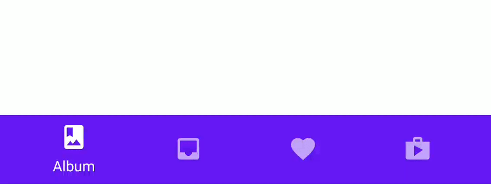
屏幕底部的材料设计主题选项卡栏可让你通过动画在不同路由之间切换。路由被延迟初始化 - 它们的屏幕组件只有在首次聚焦后才会安装。
¥A material-design themed tab bar on the bottom of the screen that lets you switch between different routes with animation. Routes are lazily initialized - their screen components are not mounted until they are first focused.
这封装了 react-native-paper 中的 BottomNavigation 组件。如果你使用 配置 Babel 插件,它不会在你的打包包中包含整个 react-native-paper 库。
¥This wraps the BottomNavigation component from react-native-paper. If you configure the Babel plugin, it won't include the whole react-native-paper library in your bundle.
安装
¥Installation
要使用此导航器,请确保你有 @react-navigation/native 及其依赖(遵循本指南),然后安装 @react-navigation/material-bottom-tabs:
¥To use this navigator, ensure that you have @react-navigation/native and its dependencies (follow this guide), then install @react-navigation/material-bottom-tabs:
- npm
- Yarn
- pnpm
npm install @react-navigation/material-bottom-tabs react-native-paper react-native-vector-icons
yarn add @react-navigation/material-bottom-tabs react-native-paper react-native-vector-icons
pnpm add @react-navigation/material-bottom-tabs react-native-paper react-native-vector-icons
该 API 还要求你安装 react-native-vector-icons!如果你使用 Expo 管理的工作流程,它将无需任何额外步骤即可运行。否则,请遵循这些安装说明。
¥This API also requires that you install react-native-vector-icons! If you are using Expo managed workflow, it will work without any extra steps. Otherwise, follow these installation instructions.
要使用此选项卡导航器,请从 @react-navigation/material-bottom-tabs 导入它
¥To use this tab navigator, import it from @react-navigation/material-bottom-tabs
API 定义
¥API Definition
💡 如果你在使用
createMaterialBottomTabNavigator时遇到任何错误,请在react-native-paper而不是react-navigation存储库上打开问题!¥💡 If you encounter any bugs while using
createMaterialBottomTabNavigator, please open issues onreact-native-paperrather than thereact-navigationrepository!
要使用此选项卡导航器,请从 @react-navigation/material-bottom-tabs 导入它:
¥To use this tab navigator, import it from @react-navigation/material-bottom-tabs:
import { createMaterialBottomTabNavigator } from '@react-navigation/material-bottom-tabs';

const Tab = createMaterialBottomTabNavigator();

function MyTabs() {
  return (
    <Tab.Navigator>
      <Tab.Screen name="Home" component={HomeScreen} />
      <Tab.Screen name="Settings" component={SettingsScreen} />
    </Tab.Navigator>
  );
}
完整的使用指南请访问 选项卡导航
¥For a complete usage guide please visit Tab Navigation
RouteConfigs
路由配置对象是从路由名称到路由配置的映射。
¥The route configs object is a mapping from route name to a route config.
属性
¥Props
Tab.Navigator 组件接受以下属性:
¥The Tab.Navigator component accepts following props:
id
导航器的可选唯一 ID。这可以与 navigation.getParent 一起使用来在子导航器中引用该导航器。
¥Optional unique ID for the navigator. This can be used with navigation.getParent to refer to this navigator in a child navigator.
initialRouteName
首次加载导航器时要呈现的路由的名称。
¥The name of the route to render on first load of the navigator.
screenOptions
用于导航器屏幕的默认选项。
¥Default options to use for the screens in the navigator.
backBehavior
这控制在导航器中调用 goBack 时发生的情况。这包括在 Android 上按设备的后退按钮或后退手势。
¥This controls what happens when goBack is called in the navigator. This includes pressing the device's back button or back gesture on Android.
它支持以下值:
¥It supports the following values:
-
firstRoute- 返回导航器中定义的第一个屏幕(默认)¥
firstRoute- return to the first screen defined in the navigator (default) -
initialRoute- 返回initialRouteNameprop 中传入的初始屏幕,如果不传则默认到第一屏幕¥
initialRoute- return to initial screen passed ininitialRouteNameprop, if not passed, defaults to the first screen -
order- 返回到聚焦屏幕之前定义的屏幕¥
order- return to screen defined before the focused screen -
history- 返回导航器中上次访问的屏幕;如果多次访问同一屏幕,较旧的条目将从历史记录中删除¥
history- return to last visited screen in the navigator; if the same screen is visited multiple times, the older entries are dropped from the history -
none- 不处理后退按钮¥
none- do not handle back button
shifting
无论是否使用平移样式,活动选项卡图标都会向上移动以显示标签,非活动选项卡不会有标签。
¥Whether the shifting style is used, the active tab icon shifts up to show the label and the inactive tabs won't have a label.
默认情况下,当你有超过 3 个选项卡时,这是 true。传递 shifting={false} 显式禁用此动画,或传递 shifting={true} 始终使用此动画。
¥By default, this is true when you have more than 3 tabs. Pass shifting={false} to explicitly disable this animation, or shifting={true} to always use this animation.
labeled
是否在选项卡中显示标签。当 false 时,仅显示图标。
¥Whether to show labels in tabs. When false, only icons will be displayed.
activeColor
活动选项卡中图标和标签的自定义颜色。
¥Custom color for icon and label in the active tab.
inactiveColor
非活动选项卡中图标和标签的自定义颜色。
¥Custom color for icon and label in the inactive tab.
barStyle
底部导航栏的样式。你可以在此处传递自定义背景颜色:
¥Style for the bottom navigation bar. You can pass custom background color here:
<Tab.Navigator
  initialRouteName="Home"
  activeColor="#f0edf6"
  inactiveColor="#3e2465"
  barStyle={{ backgroundColor: '#694fad' }}
>
  {/* ... */}
</Tab.Navigator>
如果你在 Android 上有半透明导航栏,你还可以在此处设置底部填充:
¥If you have a translucent navigation bar on Android, you can also set a bottom padding here:
<Tab.Navigator
  initialRouteName="Home"
  activeColor="#f0edf6"
  inactiveColor="#3e2465"
  barStyle={{ paddingBottom: 48 }}
>
  {/* ... */}
</Tab.Navigator>
选项
¥Options
以下 options 可用于配置导航器中的屏幕:
¥The following options can be used to configure the screens in the navigator:
title
可用作 headerTitle 和 tabBarLabel 后备的通用标题。
¥Generic title that can be used as a fallback for headerTitle and tabBarLabel.
tabBarIcon
给定 { focused: boolean, color: string } 的函数返回一个 React.Node,以显示在选项卡栏中。
¥Function that given { focused: boolean, color: string } returns a React.Node, to display in the tab bar.
tabBarColor
当与屏幕对应的选项卡处于活动状态时选项卡栏的颜色。用于涟漪效果。仅当 shifting 为 true 时才支持。
¥Color for the tab bar when the tab corresponding to the screen is active. Used for the ripple effect. This is only supported when shifting is true.
tabBarLabel
选项卡栏中显示的选项卡的标题字符串。未定义时,使用场景 title。要隐藏,请参阅上一节中的 labeled 选项。
¥Title string of a tab displayed in the tab bar. When undefined, scene title is used. To hide, see labeled option in the previous section.
tabBarBadge
显示在选项卡图标上的徽章,可以是 true 显示点,string 或 number 显示文本。
¥Badge to show on the tab icon, can be true to show a dot, string or number to show text.
tabBarAccessibilityLabel
选项卡按钮的辅助功能标签。当用户点击选项卡时,屏幕阅读器会读取此内容。如果你没有选项卡标签,建议设置此项。
¥Accessibility label for the tab button. This is read by the screen reader when the user taps the tab. It's recommended to set this if you don't have a label for the tab.
tabBarTestID
在测试中找到此选项卡按钮的 ID。
¥ID to locate this tab button in tests.
活动
¥Events
导航器可以对某些操作进行 触发事件。支持的事件有:
¥The navigator can emit events on certain actions. Supported events are:
tabPress
当用户按下选项卡栏中当前屏幕的选项卡按钮时会触发此事件。默认情况下,按 Tab 键会执行以下几项操作:
¥This event is fired when the user presses the tab button for the current screen in the tab bar. By default a tab press does several things:
-
如果选项卡未获得焦点,按下选项卡将使该选项卡获得焦点
¥If the tab is not focused, tab press will focus that tab
-
如果该选项卡已获得焦点:
¥If the tab is already focused:
-
如果选项卡的屏幕呈现滚动视图,你可以使用
useScrollToTop将其滚动到顶部¥If the screen for the tab renders a scroll view, you can use
useScrollToTopto scroll it to top -
如果选项卡的屏幕呈现堆栈导航器,则会在堆栈上执行
popToTop操作¥If the screen for the tab renders a stack navigator, a
popToTopaction is performed on the stack
-
要防止默认行为,你可以调用 event.preventDefault:
¥To prevent the default behavior, you can call event.preventDefault:
React.useEffect(() => {
  const unsubscribe = navigation.addListener('tabPress', (e) => {
    // Prevent default behavior

    e.preventDefault();
    // Do something manually
    // ...
  });

  return unsubscribe;
}, [navigation]);
帮手
¥Helpers
选项卡导航器将以下方法添加到导航属性中:
¥The tab navigator adds the following methods to the navigation prop:
jumpTo
导航到选项卡导航器中的现有屏幕。该方法接受以下参数:
¥Navigates to an existing screen in the tab navigator. The method accepts following arguments:
-
name- string - 要跳转到的路由名称。¥
name- string - Name of the route to jump to. -
params- object - 屏幕参数传递到目标路由。¥
params- object - Screen params to pass to the destination route.
navigation.jumpTo('Profile', { name: 'Michaś' });
示例
¥Example
import { createMaterialBottomTabNavigator } from '@react-navigation/material-bottom-tabs';
import MaterialCommunityIcons from 'react-native-vector-icons/MaterialCommunityIcons';

const Tab = createMaterialBottomTabNavigator();

function MyTabs() {
  return (
    <Tab.Navigator
      initialRouteName="Feed"
      activeColor="#e91e63"
      barStyle={{ backgroundColor: 'tomato' }}
    >
      <Tab.Screen
        name="Feed"
        component={Feed}
        options={{
          tabBarLabel: 'Home',
          tabBarIcon: ({ color }) => (
            <MaterialCommunityIcons name="home" color={color} size={26} />
          ),
        }}
      />
      <Tab.Screen
        name="Notifications"
        component={Notifications}
        options={{
          tabBarLabel: 'Updates',
          tabBarIcon: ({ color }) => (
            <MaterialCommunityIcons name="bell" color={color} size={26} />
          ),
        }}
      />
      <Tab.Screen
        name="Profile"
        component={Profile}
        options={{
          tabBarLabel: 'Profile',
          tabBarIcon: ({ color }) => (
            <MaterialCommunityIcons name="account" color={color} size={26} />
          ),
        }}
      />
    </Tab.Navigator>
  );
}
与 react-native-paper 一起使用(可选)
¥Using with react-native-paper (optional)
你可以使用 react-native-paper 中的主题支持通过将你的应用封装在 Provider 从 react-native-paper 中来自定义材质底部导航。一个常见的用例是当你的应用具有深色主题时自定义屏幕的背景颜色。跟随 react-native-paper 文档中的说明 学习如何自定义主题。
¥You can use the theming support in react-native-paper to customize the material bottom navigation by wrapping your app in Provider from react-native-paper. A common use case for this can be to customize the background color for the screens when your app has a dark theme. Follow the instructions on react-native-paper's documentation to learn how to customize the theme.